NZTE ‣ Beachheads Directory Filters: Advanced filter pattern leveraging e-commerce patterns
Project overview
Business context
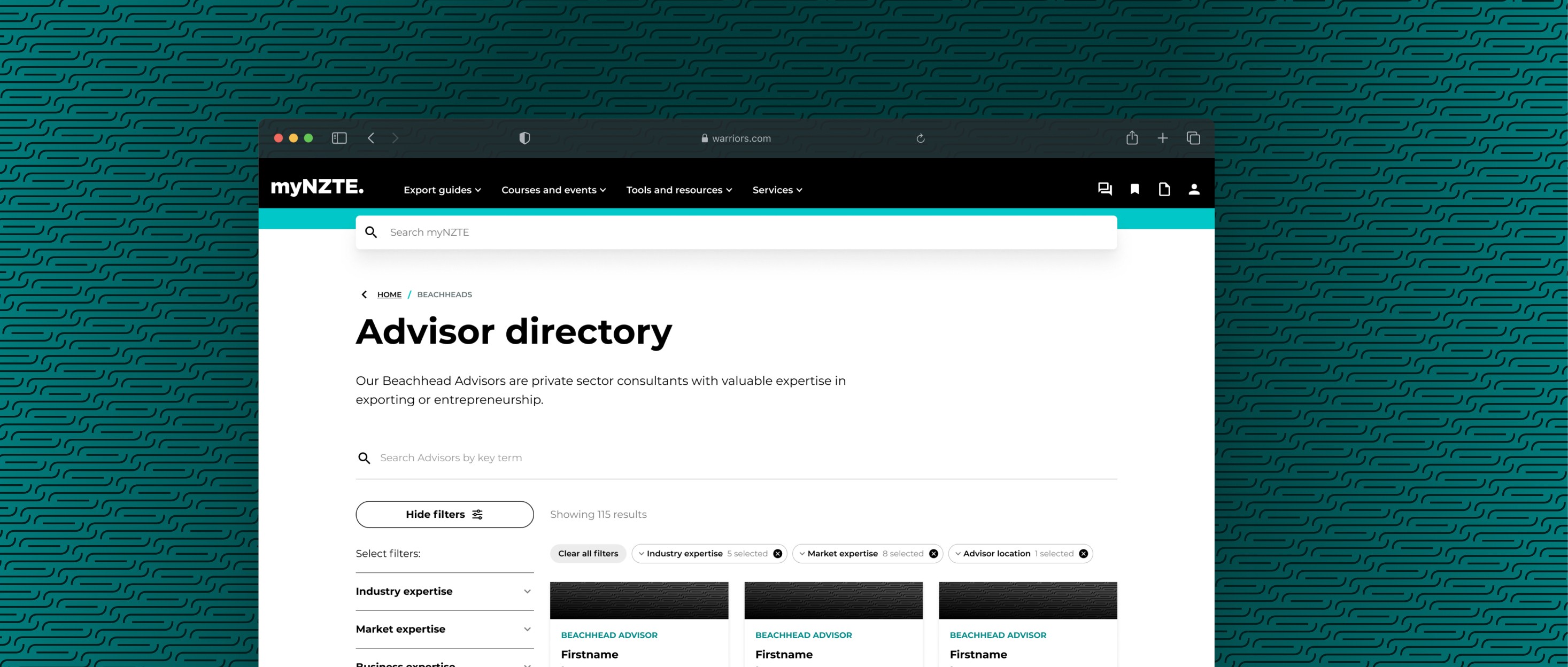
The 'Beachheads Advisor Directory' was a feature developed to enhance the visibility of Beachhead advisors and improve customer engagement by making advisor profiles accessible, useful, and discoverable on myNZTE. This directory allowed customers to search and filter advisors based on Industry, Market, Business Expertise, or Advisor Location.
Beachhead Advisors are private sector consultants with valuable expertise in exporting and entrepreneurship. NZTE engages these advisors to assist customers with specific needs, challenges, or strategic development.
The directory aimed to:
Create an experience on myNZTE that enables customers to easily identify and select appropriate advisors.
Provide a platform for customers to engage directly with advisors, speeding up the consultation process.
Make sure advisors information is relevant and up-to-date so that customers are engaging with the right advisors based on the right information
The challenge
The project was initiated in response to some critical usability feedback regarding the search and filtering functionality on the directory. I was tasked with understanding and resolving these issues.
Design goals
Understand and resolve the usability issues
Leverage the implementation as a way to experiment with building design system patterns
Problems + Opportunities
Summary of feedback
Our analysis of user feedback on the existing filters revealed several key issues and opportunities for improvement:
Interface Challenges
Search Bar Visibility
The search bar positioned directly under navigation is often overlooked by users.
Filter Interaction Issues
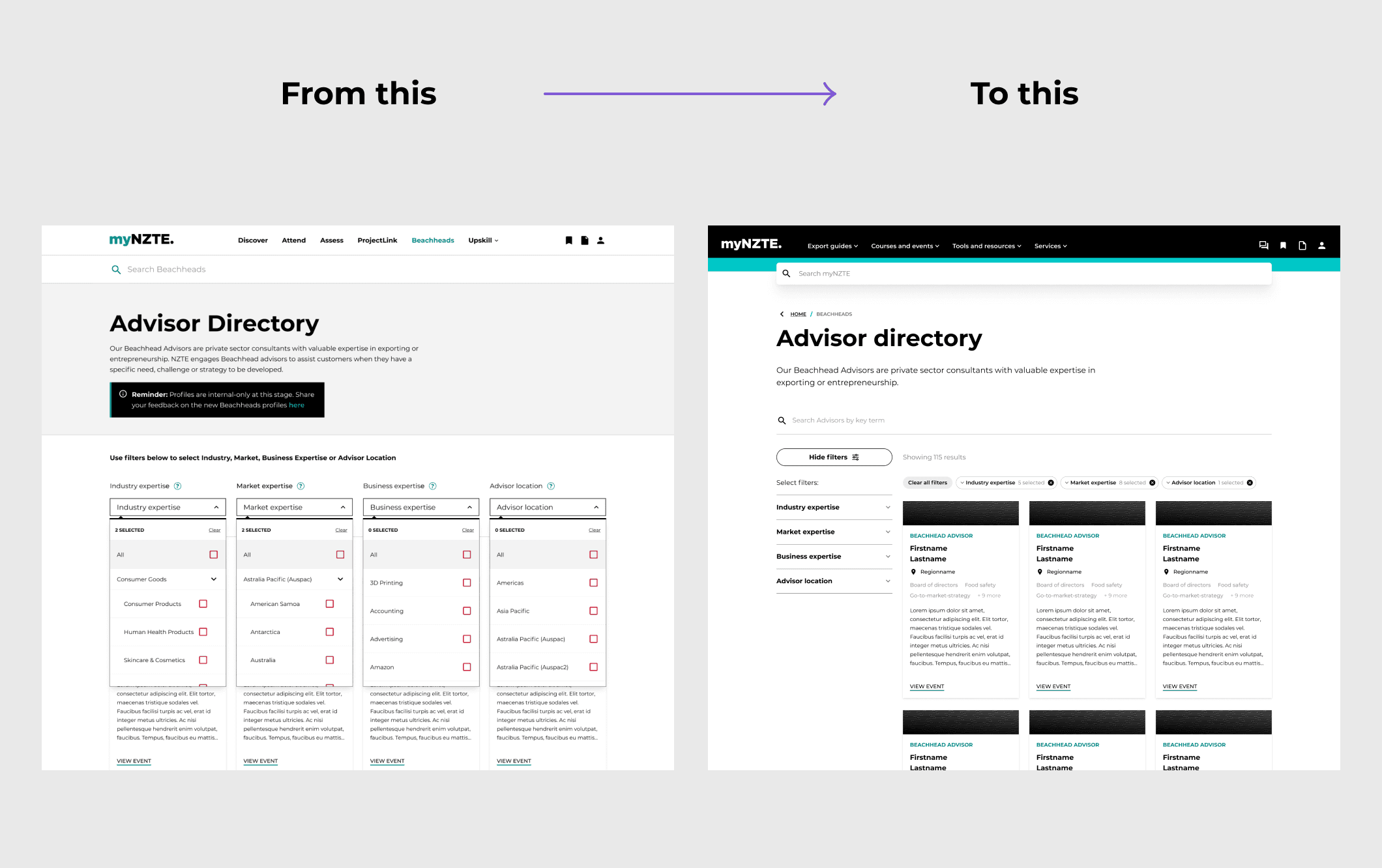
Horizontal filter load causes immediate page refresh, leading to a buggy experience when users switch between filters.
Slow loading times impact user experience when selecting filter boxes.
Dropdown Menu Problems
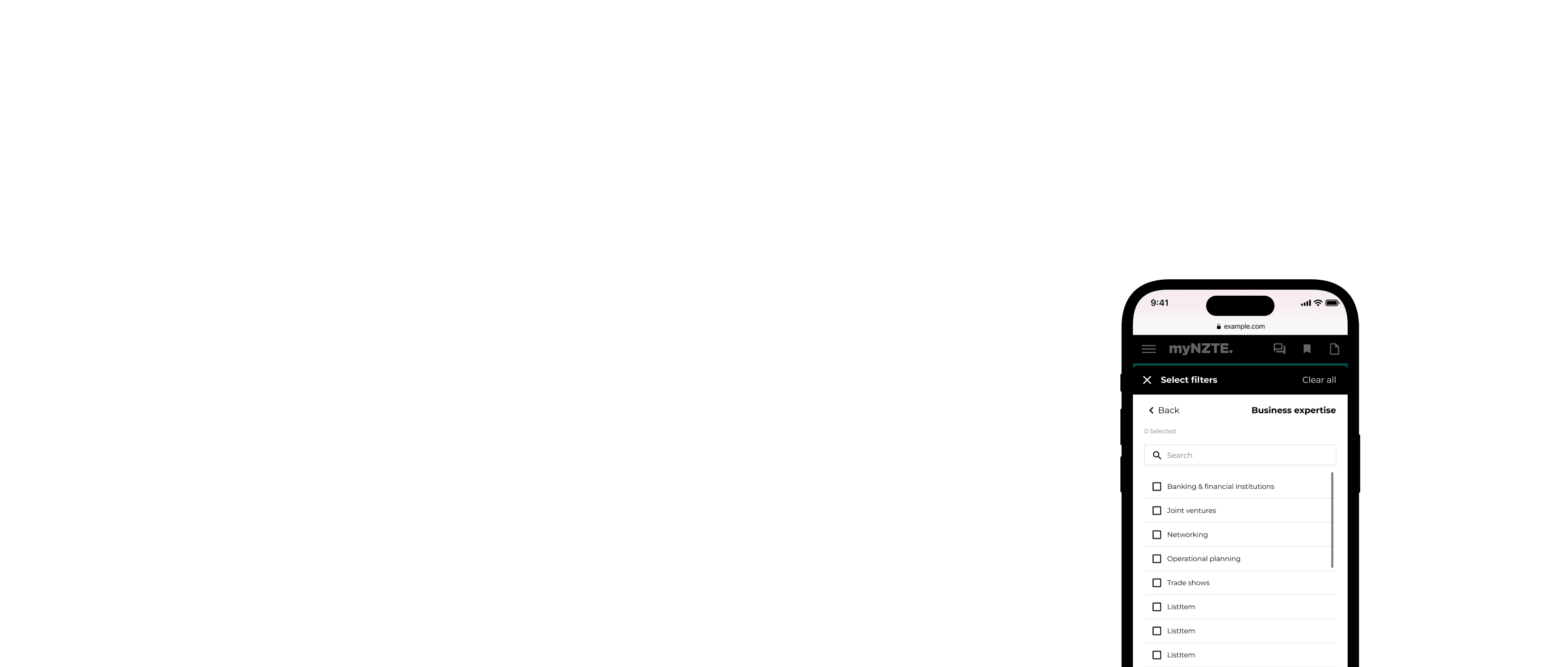
Users find the dropdown UI cumbersome and difficult to use.
Excessive spacing in drop-downs creates a clunky user experience.
Search Functionality Limitations
Lack of key term search capability (e.g., "US and F&B").
Inability to select all items within a list or category.
Categories and Filters Improvements
Country Organisation
Current country order is counterintuitive; users suggest alphabetical order with key markets at the top.
Difficulty in finding specific countries (e.g., USA) due to nested categorisation.
Location Specificity
For the US, state location is more relevant than city (e.g., Massachusetts vs. Andover).
Category Clarity
Confusion between similar categories (e.g., business expertise vs. industry experience, market expertise vs. advisor location).
Requests for more specific or reorganised categories (e.g., separating home furnishings from consumer products).
Market-Specific Customisation
Suggestions to prioritise local markets in filter options (e.g., United States first for US-based users).
Data Accuracy and Relevance
Mismatched Data
Advisors not appearing in relevant categories.
Inconsistencies in country expertise (e.g., Canada and US combined despite advisors having country-specific expertise).
Over-specification
Some criteria appear too finely tuned, leading to irrelevant results.
Outdated Information
User profiles contain outdated details (e.g., former relationship managers still listed).
Data Integrity
Some advisor profiles show an implausibly wide range of expertise, reducing the database's credibility and usefulness.
Research approach
After a bit of exploration, I quickly realised that there was a wealth of research and innovation in filtering design patterns thanks to online shopping
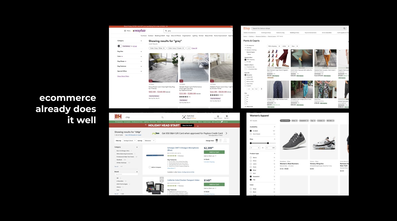
My research approach included:
E-commerce Usability Studies
Leveraged large-scale research and usability studies on filtering and search patterns across e-commerce platforms.
Analysed how these patterns could be adapted to our specific context of advisor directory search.
Industry Thought Leadership
Reviewed design articles and opinion pieces from respected UX professionals.
Synthesised current trends and forward-thinking approaches in search and filter design.
Design System Analysis
Examined existing design systems and their component libraries.
Identified reusable patterns and components that could be adapted for our needs.
Peer and User Insights
Conducted informal surveys with colleagues and industry peers.
Gathered anecdotal evidence on both positive and negative experiences with search and filtering interfaces in online shopping.
Competitive Analysis
Compiled a reference board of exemplary sites demonstrating effective search and filter implementations.
Analysed these examples to extract applicable design principles and interaction patterns.
This approach provided a great foundation for any design decisions I made going forward - I wanted to make sure that any solutions were grounded in best practices and backed by a certain level of research.
Research References
https://www.smashingmagazine.com/2015/04/the-current-state-of-e-commerce-filtering/
https://baymard.com/blog/horizontal-filtering-sorting-design/
https://baymard.com/blog/allow-applying-of-multiple-filter-values
https://www.interaction-design.org/literature/topics/progressive-disclosure
https://techblog.commercetools.com/how-we-transformed-the-product-search-for-the-better-7f8ac75dbeba
https://developers.google.com/search/blog/2014/02/faceted-navigation-best-and-5-of-worst
https://uxplanet.org/9-filtering-design-best-practices-to-improve-e-commerce-ux-edac50560f94
https://baymard.com/blog/how-to-design-applied-filters#implementation--considerations
https://www.portent.com/blog/analytics/research-site-speed-hurting-everyones-revenue.htm
https://www.elasticpath.com/blog/improving-ecommerce-website-performance
Research insights
Let the user guide the filtering process
Need to understand and define users intent when searching and filtering in different areas and the risks associated with each approach. This could range from discovery/exploratory (open ended searching) to specific searches (where users need to know exactly what is available
Use interactive filters if your users are exploratory in their search. Use batch filtering when your users have clear refinement criteria, or you know that your site will be slow at least occasionally (e.g., on mobile devices)
Factors in deciding an approach - user intent (does the user plan to specify multiple filtering criteria or just one) and site speed (how fast the results are presented to the user).”
Apply progressive disclosure to filters (kinda)
Completing simple actions or tasks > Disclosing more complex, secondary features only if a user asks for them.
Provides a tiered environment where most users can proceed with their tasks effectively and efficiently.
Allow discovery type users to proceed without frustration while keeping specific type users satisfied with higher-end functionality.
Don’t try and make a one-size-fits-all filter solution
Plenty of large scale research and usability studies have been done on filtering and search across e-commerce sites (the closest use-case for myNZTE user’s needs. [referring to a large scale filtering and search audit] “...most critically, many sites have adopted a fundamentally flawed “one size fits all” approach which greatly impedes the user’s product finding ability.”
Filters can help show a user you understand your offering
Think of the filtering system on your site as another option for improving the UX. Treat product filters as solutions for dealing with users’ problems. Good filtering design not only allows customers to find the product that is the best bet for them but also shows them that you know your product inside out.
Reframing the problem

Solutions
Usability recommendations
To help communicate my findings to stakeholders - I created some some concept designs that summarised key recommendations for improving the filtering experience. These recommendations were categorised by; Solutions, General Improvements, and any Potential Dependencies.
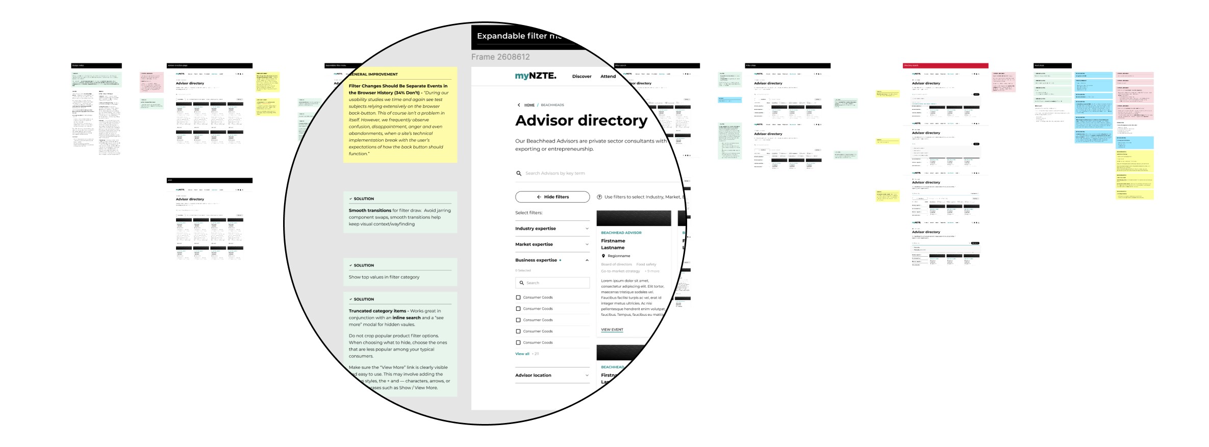
The concepting stage is also where I started involving engineers in understanding any technical feasibility and in helping shape the solution.
Here was an alternate concept I explored.

Solutions
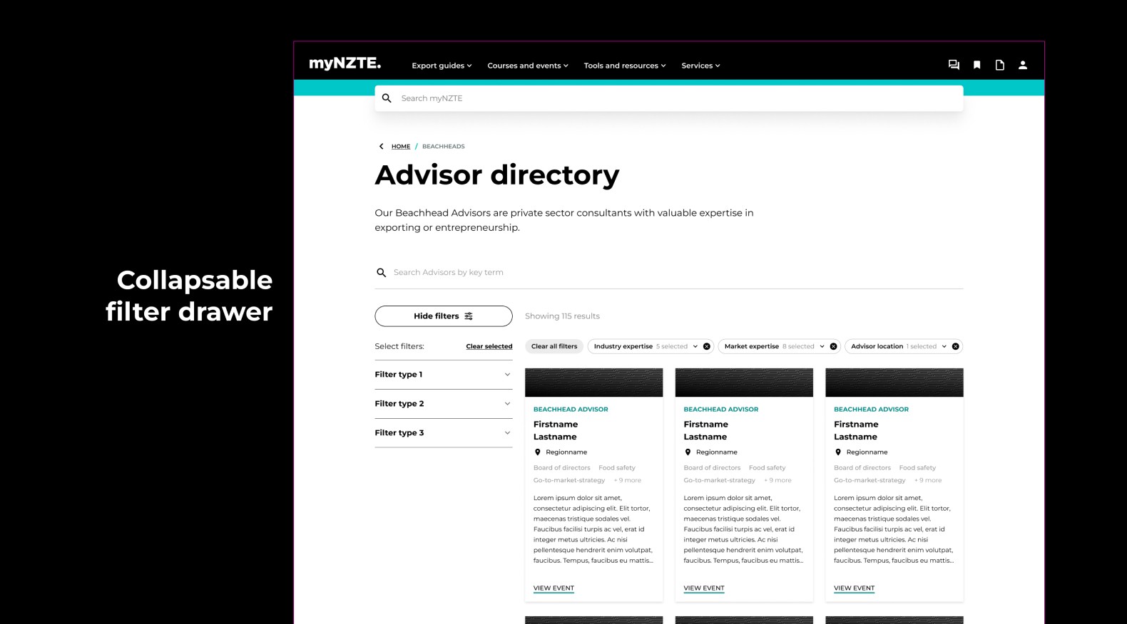
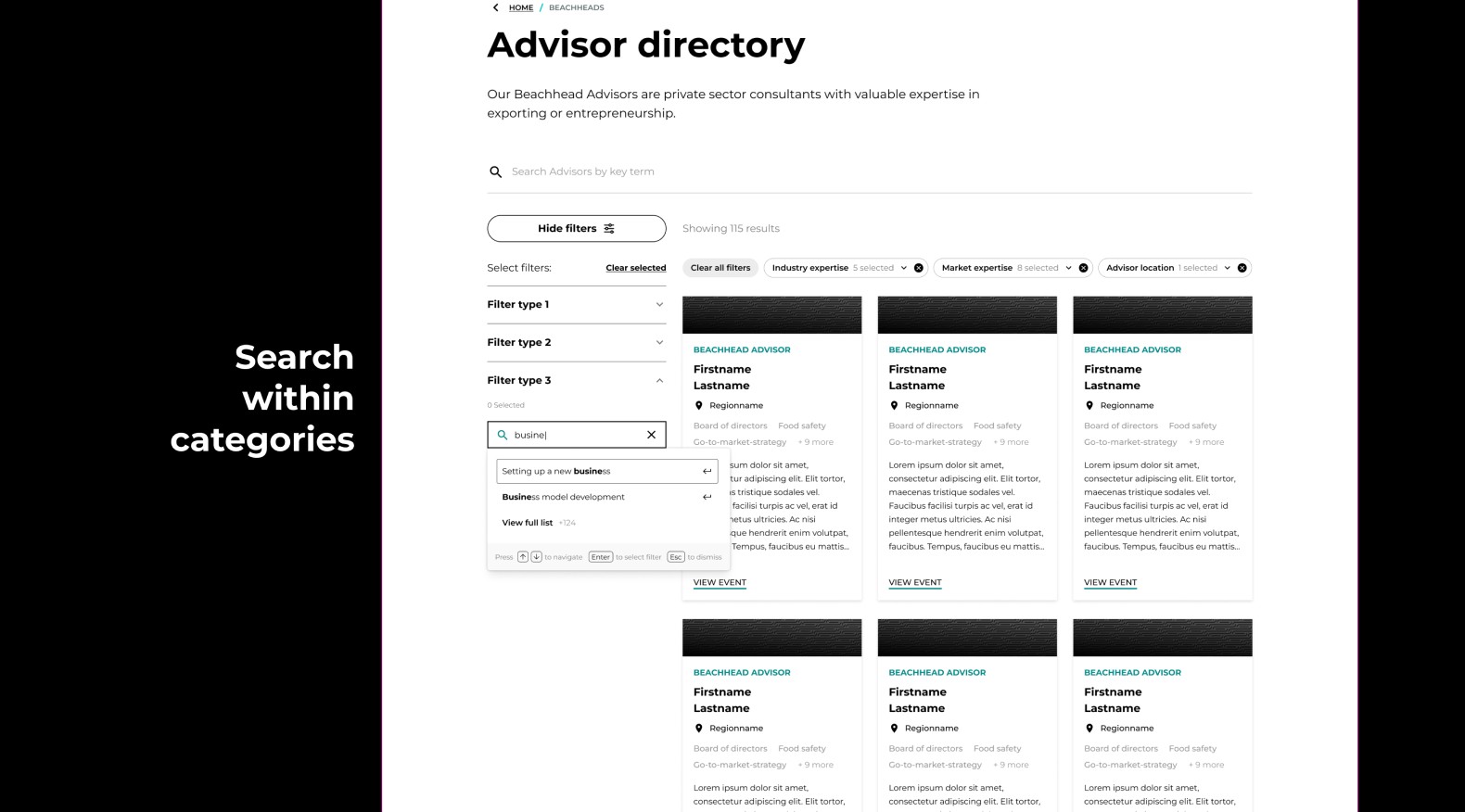
After a couple of rounds of usability testing and iterating through multiple versions, we identified these key features for build.



Thanks for reading, check out some of my other work below.
