NZTE ‣ Pallet Design System: The early discovery and implementation of myNZTE's first design system
Project overview
Business context
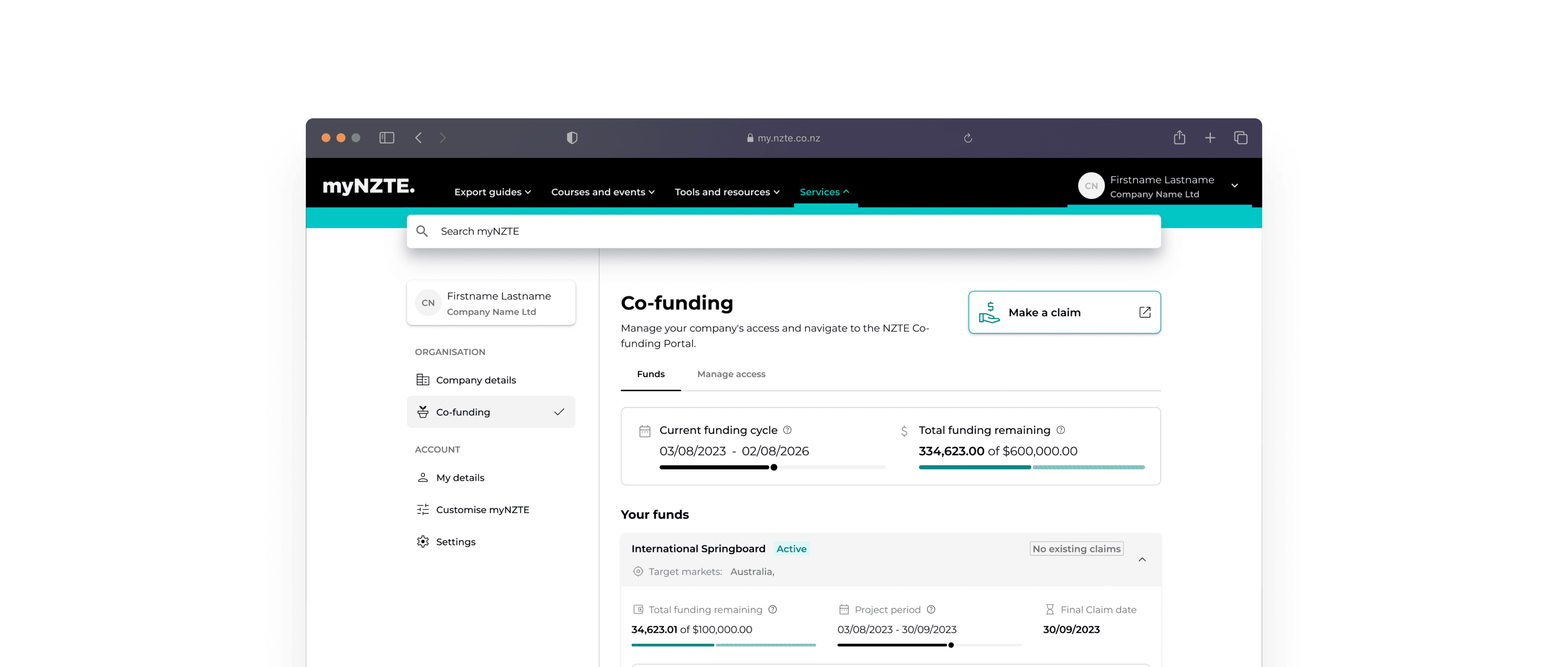
myNZTE is a customer-facing website created by New Zealand Trade and Enterprise (NZTE) that provides exporting businesses with an online resource. This includes best-practice exporting advice, market research, tools and templates, case studies, and upcoming events.
At the time, I was working within NZTE's 'Smarter Focus' squad, one of two product delivery teams designing and building features for myNZTE and internal digital capability.
The challenge
As often happens with early-stage products, we had quickly built numerous features without establishing proper foundations. As we scaled our capabilities, our design and development standards became fragmented and inconsistent over time.
What we knew
With several major projects on the horizon, there was a shared understanding that our current approach was not going to be efficient.
Features lacked consistency in look and feel
Our product was rife with accessibility sins
A growing misalignment between development and design teams, leading to increasing tension.
The more we built, the more tech and design debt accumulated.
We recognised that if we didn't address these underlying issues, it would become increasingly difficult to build products at pace, meet accessibility requirements and achieve business objectives.
The proposed solution
Create a living, single source of truth and shared language for all standards, styles, components, and patterns. This system would empower implementers in creating better products for end-users.
We were primed to explore this solution - we just needed resource.
Problems + Opportunities
Catalyst
The journey began when our Digital Lead, UX lead, and I attended the online UX New Zealand conference. After listening to keynote after keynote about design systems we'd found the answer to all of our design problems (well, kinda). Figma had also just announced their support for tokens and variables and the whole design world was talking about design systems and tokens - so, it felt like it was worth exploring.
Inspired, we booked out a meeting room and brainstormed a strategy to pitch this idea internally and start defining the 'if' and 'why' NZTE needed a design system.

Current state
Before considering solutions, we needed to understand our current state and identify pain points. What was going wrong? Why was it going wrong.
So, we got talking to devs, analysts and also reflected on our own experience as designers.
Here's what we found, and it was pretty brutal…
Key Issues
Inefficiency
Duplicate work between design and development teams
Design creating bottlenecks for developers
Last-minute tweaks and changes
Underutilisation of ChakraUI standards
Neglecting Critical Standards
Failing to meet accessibility requirements
Non-compliance with government digital standards
Inconsistency in Production
Development of one-off or redundant components
Lack of standardised naming conventions
Releases without design sign-off
Absence of a Single Source of Truth
Difficult-to-navigate Storybook
Disorganised Figma files
Lack of developer standards
Missing Foundational Principles
Inconsistent communication channels
Confusing onboarding experience
Lack of documentation for component and pattern usage
Quality and Consistency Concerns
Misaligned understanding of build quality standards
Inconsistent and non-semantic naming conventions
Accumulating design and technical debt
Arbitrary colour system lacking usage guidelines and accessibility ratings
Base styles using absolute pixel values instead of relative units
Inconsistent use of semantic HTML

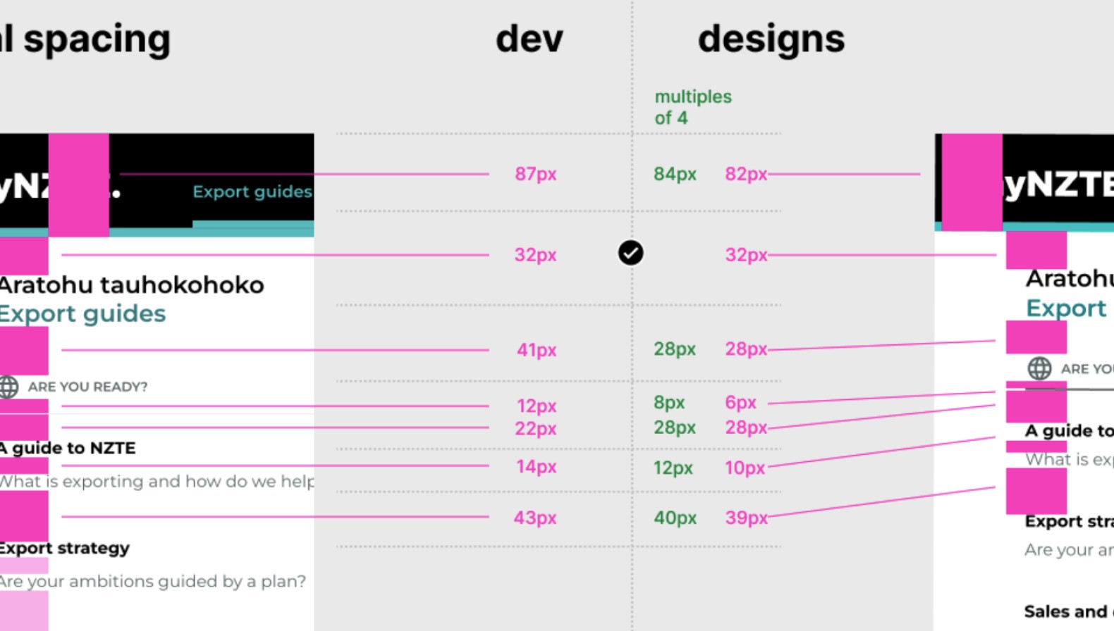
Example of the differences between dev and design.
Highlights of staff envisioned what a useful design system might look like.

Ideal future state
A living, single source of truth and shared language for all standards, styles, components, and patterns. It should serve both consumers of the system and end-users of the product and provide tangible business value
What are we creating?
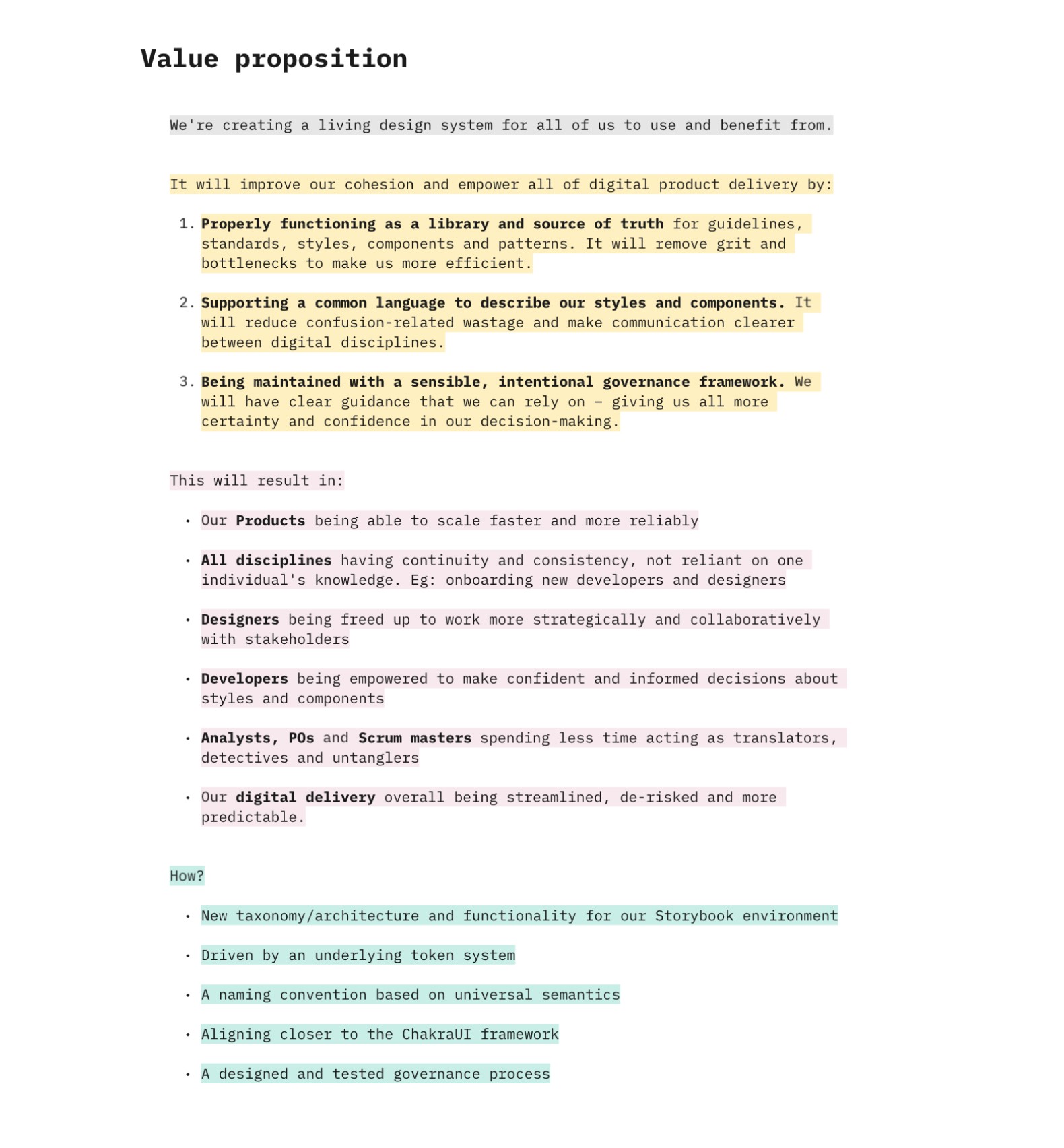
Credit to the UX Lead for this Value prop. This basically became the doc I referred to the most throughout the project.
Outputs
Advocating through educating
One of the most challenging aspects of implementing a design system is helping stakeholders understand its value, the why. Up to this point lot of conversations had happened with business stakeholders in selling the value from a business perspective. This was framed around metrics, dev and design time saved as an expense.
For the product builders (devs, designers, BA's) though, it was more focussed on how it could positively affect how they implemented products.
In an effort to not overload people with all our ideas - we started with one technical concept and highlighted the value it would give to their day to day and known product use cases.
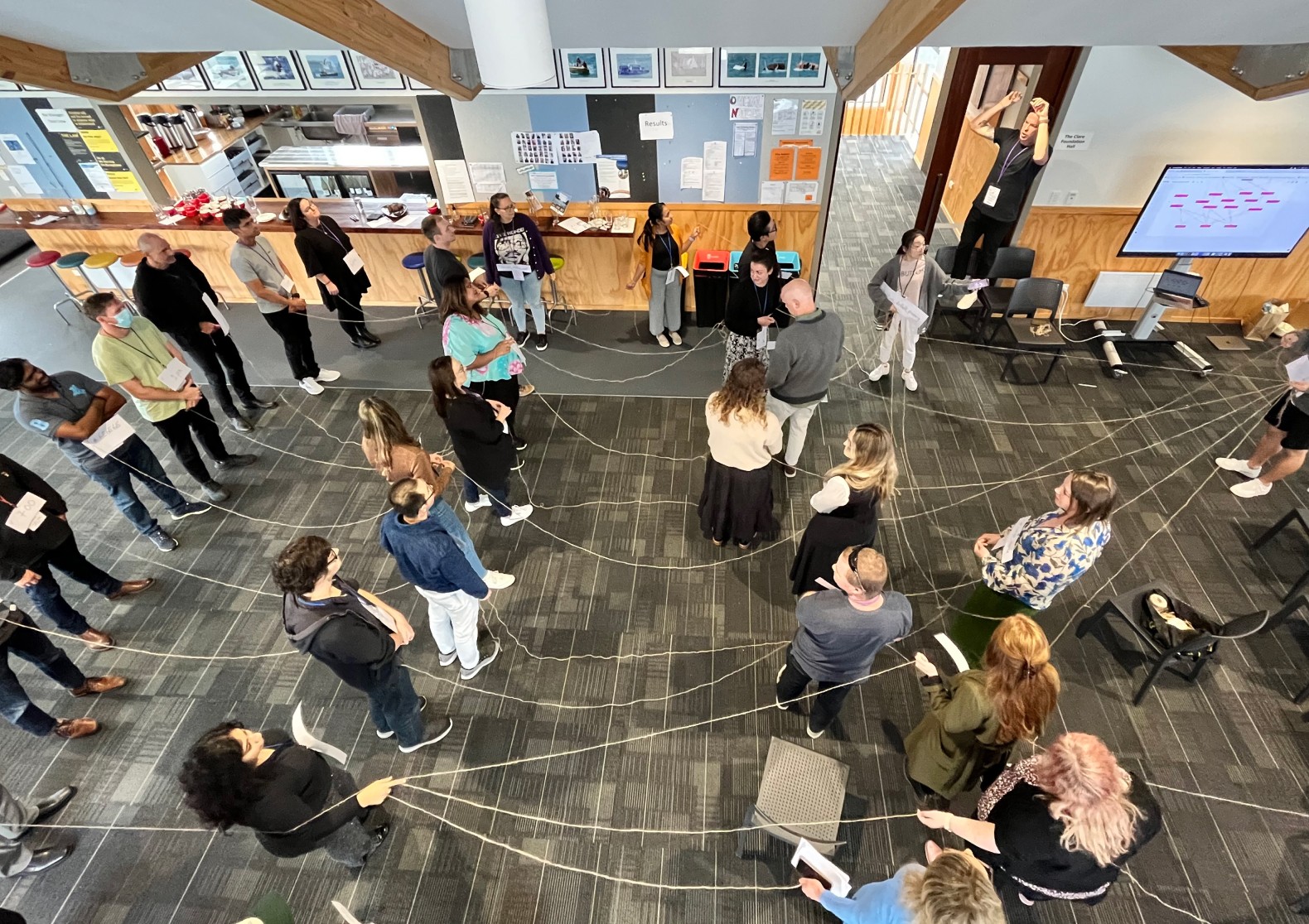
We capitalised on a well-timed team day in Wellington where our UX Lead, Tech Lead, and I conducted a kickoff learning session to explain the value of design systems and design tokens


We then attempted to demonstrate key value pairs and semantic tokens using our staff as variables.
We think they got it…
Implementation
After receiving approval from our digital lead, we pitched to a product manager who gave us the green light to form a small, focused team under the "smarter working" squad that would venture into the unknown and create the foundations of the design system in parallel with the squad's product delivery.
I got the opportunity to lead this small team, consisting of myself and three developers. We were granted autonomy in our approach, meeting weekly for hours to brainstorm ideas and figure things out through experimentation.

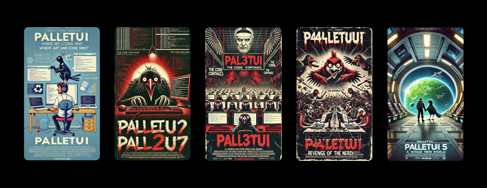
And we got a little carried away using AI to create a team poster
The task ahead
Our task was to design and build a new set of features using only the design system. This covered:
Foundational tokens and components
Component specification and documentation
First steps towards a governance framework
Developer standards for building with the design system
Design toolkit for design creation and handover
Ensure WCAG 2.0 compliance for primitives and foundational components
Constraints
Leverage existing tools and their limitations (ChakraUI as our existing framework)
Limited development and design time, as we continued to build features in parallel
Navigate the unknown – significant discovery work still needed doing
Our guiding principles/quotes:
Help developers "fall into a pit of success"
"Learn through doing"
"We don't know, what we don't know"
Foundational work
Design tokens
There's a lot of ways to structure your tokens - as we were purely building for web (no mobile app) we decided to build our tokens around ChakraUI's theme. This meant we got a lot for free and saved the need to map tokens from a separate repository.

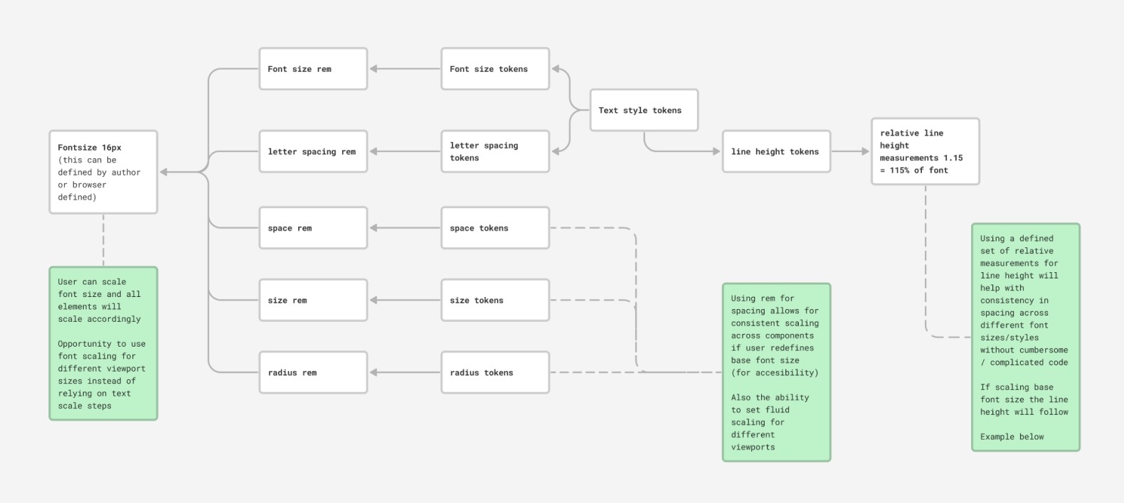
After a few iterations we'd created our tokens for typography, colour, spacing, size, radius, shadow, and border - we decided on two levels of abstraction:
Base tokens - aka primitives. These are basically a limited set of pre-defined variables.
Semantic tokens - aka alias tokens. These reference the base tokens, ensuring that changes to base tokens propagate through the semantic layer.
Typography
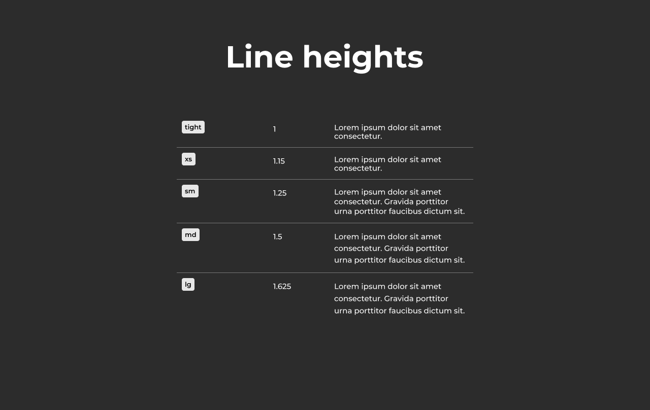
Created base tokens for font size, font weight, line height, and letter spacing. These were tested out in a variety of different layouts and contexts.
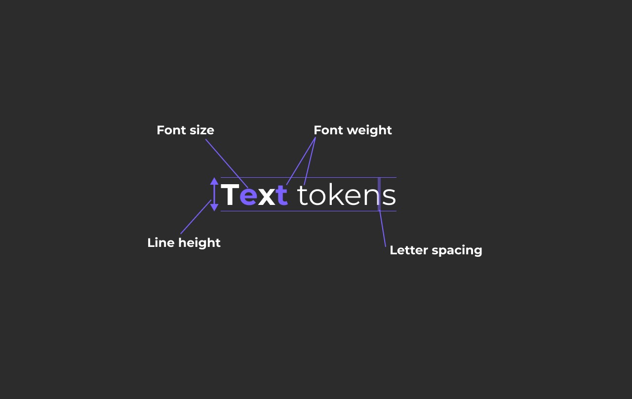
To build hierarchy into our typography, we adopted a modular font size scale. This approach ensured clear and consistent headings, readable paragraphs, and accessible input fields across myNZTE. We explored using a clamp + browser query, but opted for a set scale across 4 different break points that uses different scaling ratios for each viewport sizes:
Larger viewports: 1.33 ratio
Smaller screen sizes: 1.2 ratio

Implemented relative line heights for all text and rem units for text sizes rather than absolute values - this ensured all values would follow browser text size.
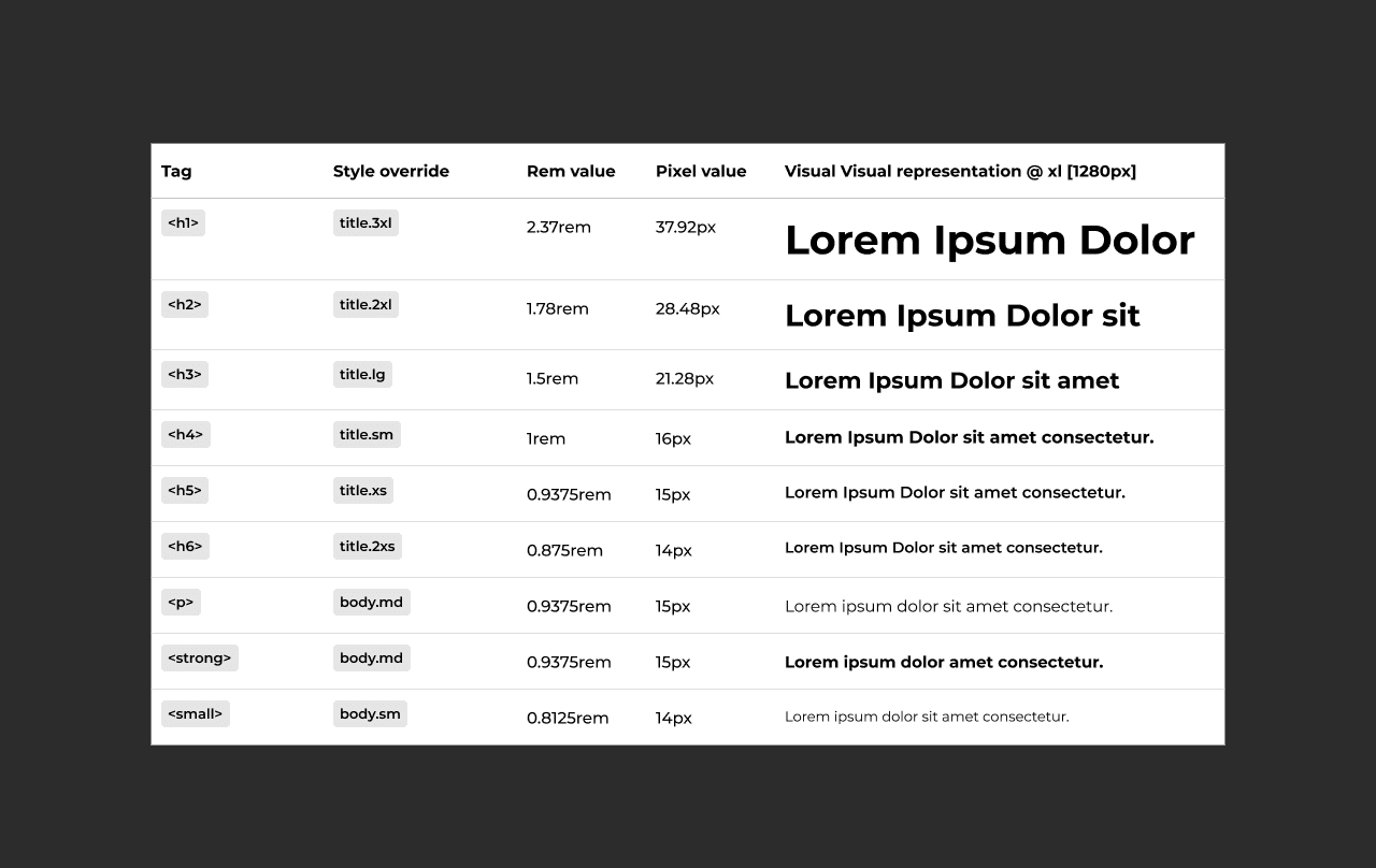
The base scale was also mapped to default html section headings - this carried over to the CMS title hierarchy.
Colour
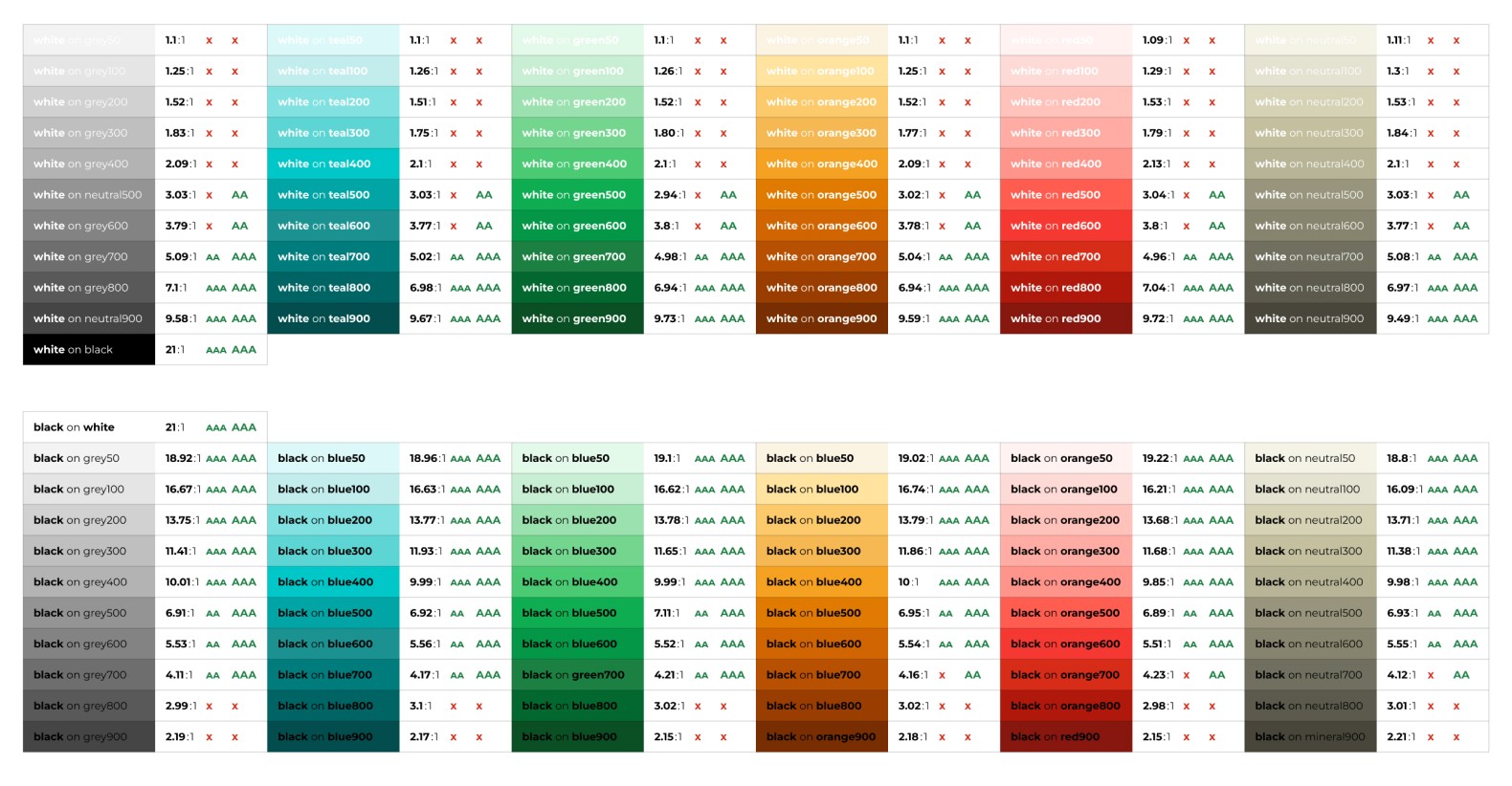
The base colour values 50-900 were generated using LCH (Lightness - Chroma - Hue) a perceptual colour space, meaning it represents colours in a way that is more similar to how the human eye perceives them.
Using the LCH colour space helped:
Ensure built-in accessibility through consistent contrast between colours
Maintain near-identical contrast ratios at the same LCH lightness scale values across different. For example neutral600 will have the same perceived lightness and contrast as teal600.
Create colour scales that weren't washed out.

Additionally colour combinations were tested to meet WCAG 2.0 AA standard - but also future proofing by meet APCA colour standards (potential for WCAG 3.0 standard) which also accounts for text size and weight. This is represented in the two rating columns below.
Using the base scales, created semantic tokens for Surfaces, Text, Stroke and Fill. This guaranteed all colour combinations had equal contrast scores.

Supported with clear naming conventions

and interactive values

Spacing & Size
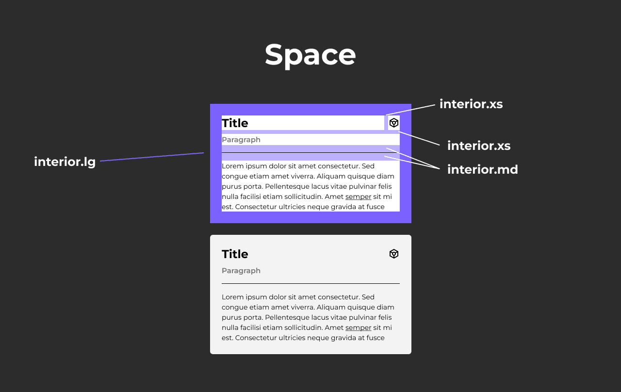
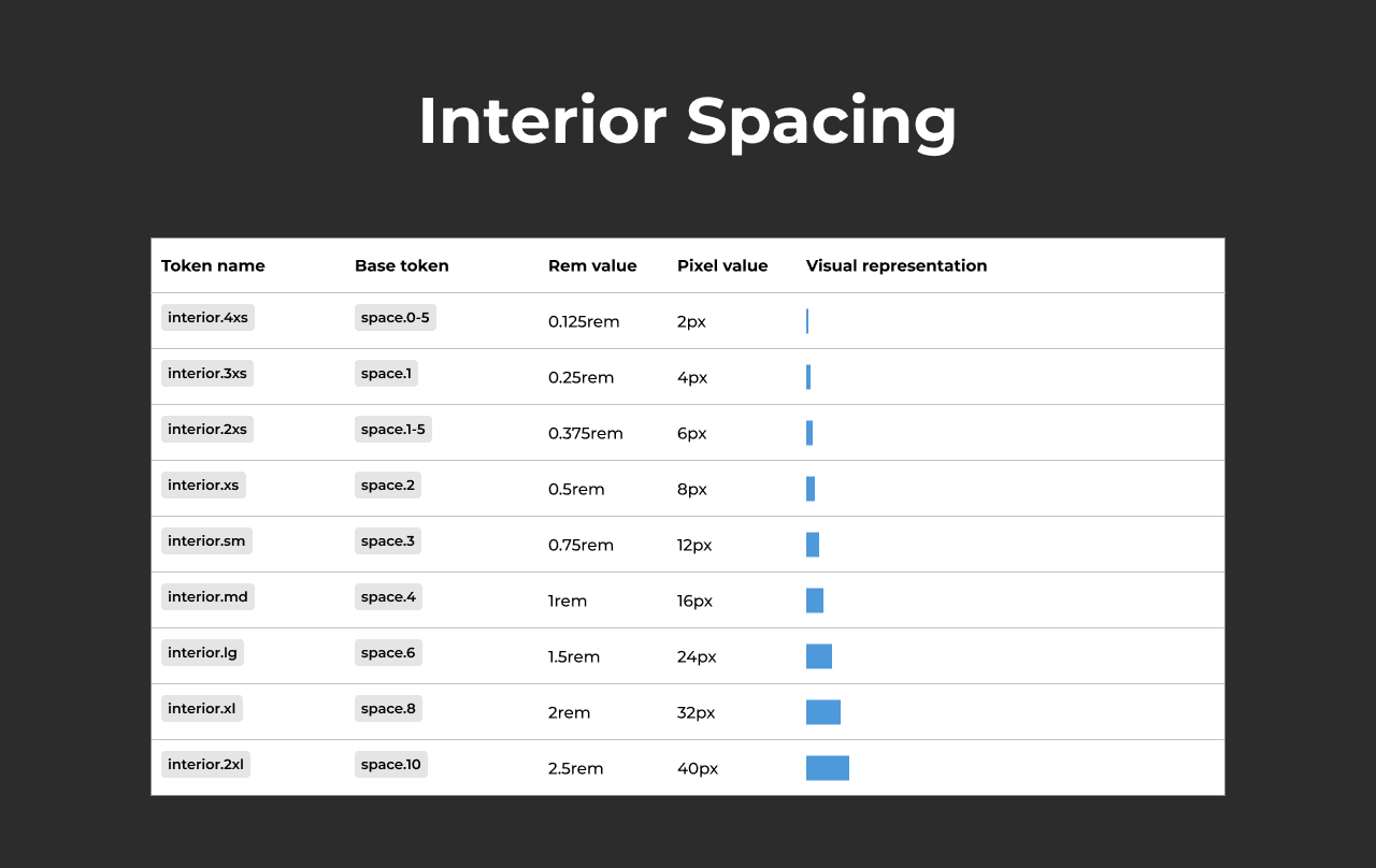
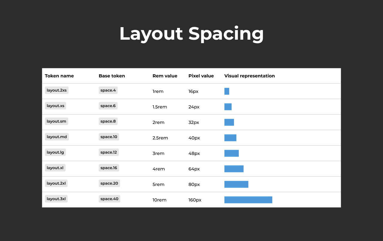
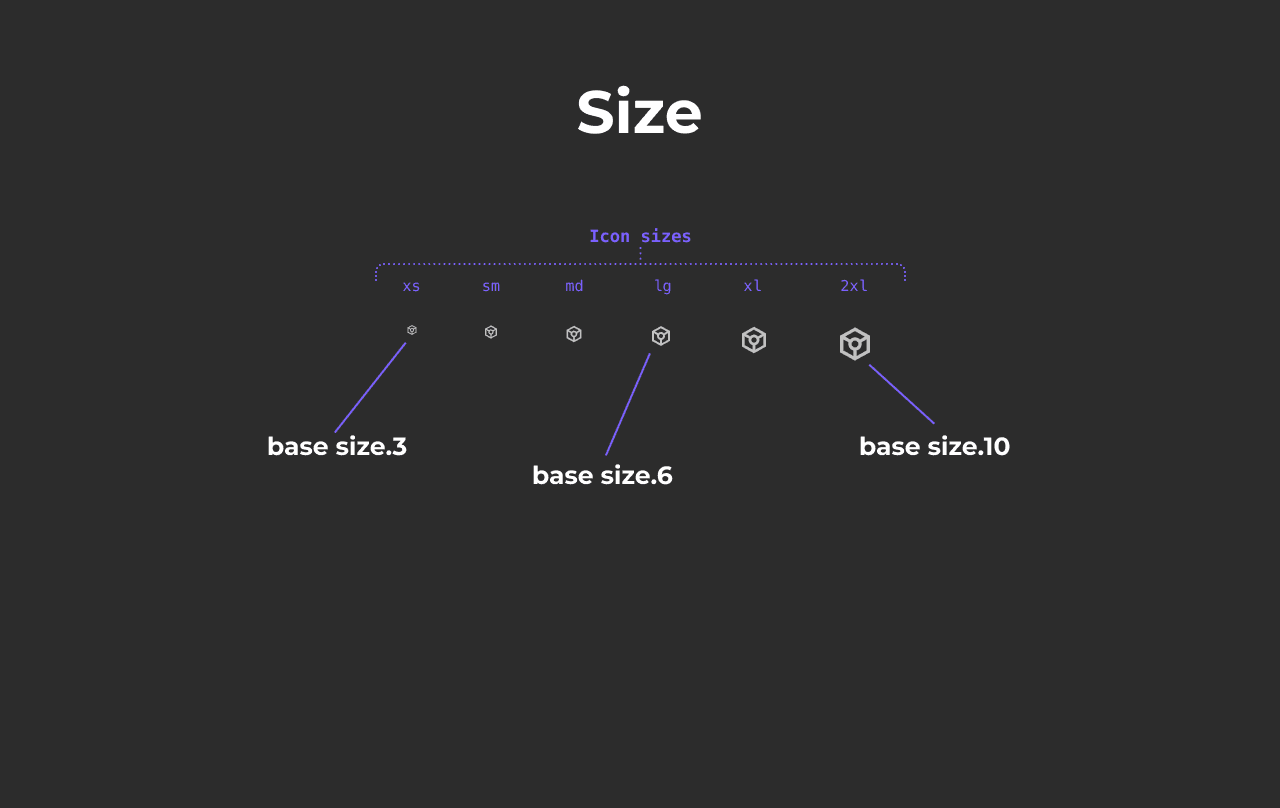
Standardised rem units of spacing with equivalent size scales to maintain hierarchy across different elements uniformly.

Design toolkit
Created a new set of linked design libraries / files in Figma.
Design tokens - All variables and styles to be used in all design files.
Component library - All foundational components and patterns
Icon library - Separate file for managing icons, primarily used Google Material icon kit.
Design file templates

Core components
Our component strategy focused on:
Developing foundational components
Creating comprehensive component specifications, documentation, and developer handover processes
Emphasising composability to make our design system less opinionated
Implementing an intuitive information architecture for easy component discovery
Aligned with the same props as Chakra UI components
Organising component taxonomy and categories.
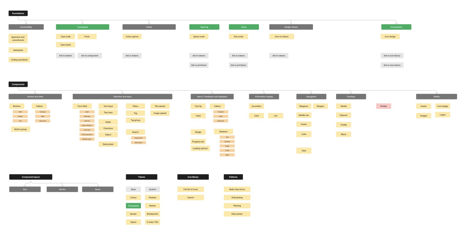
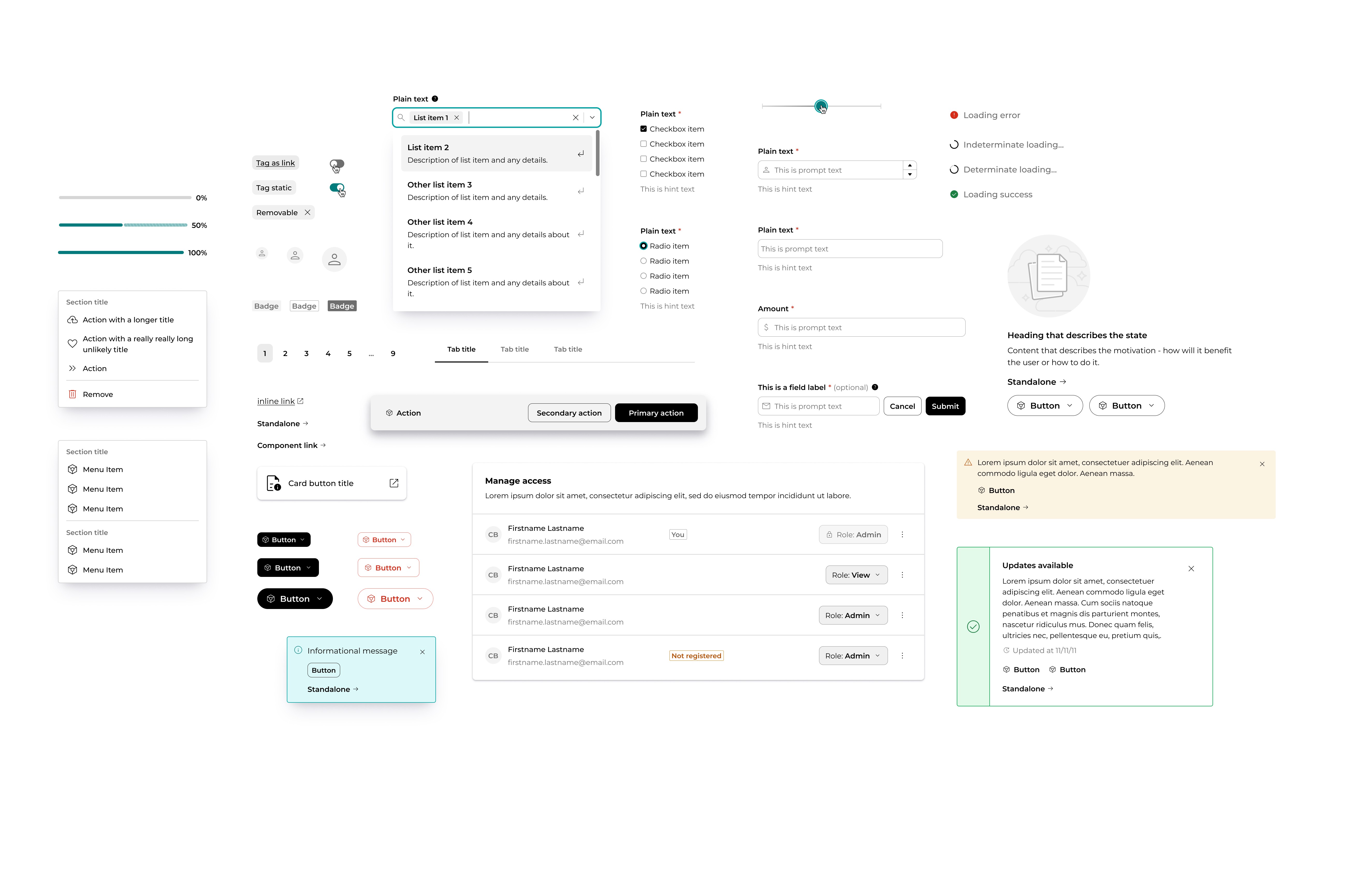
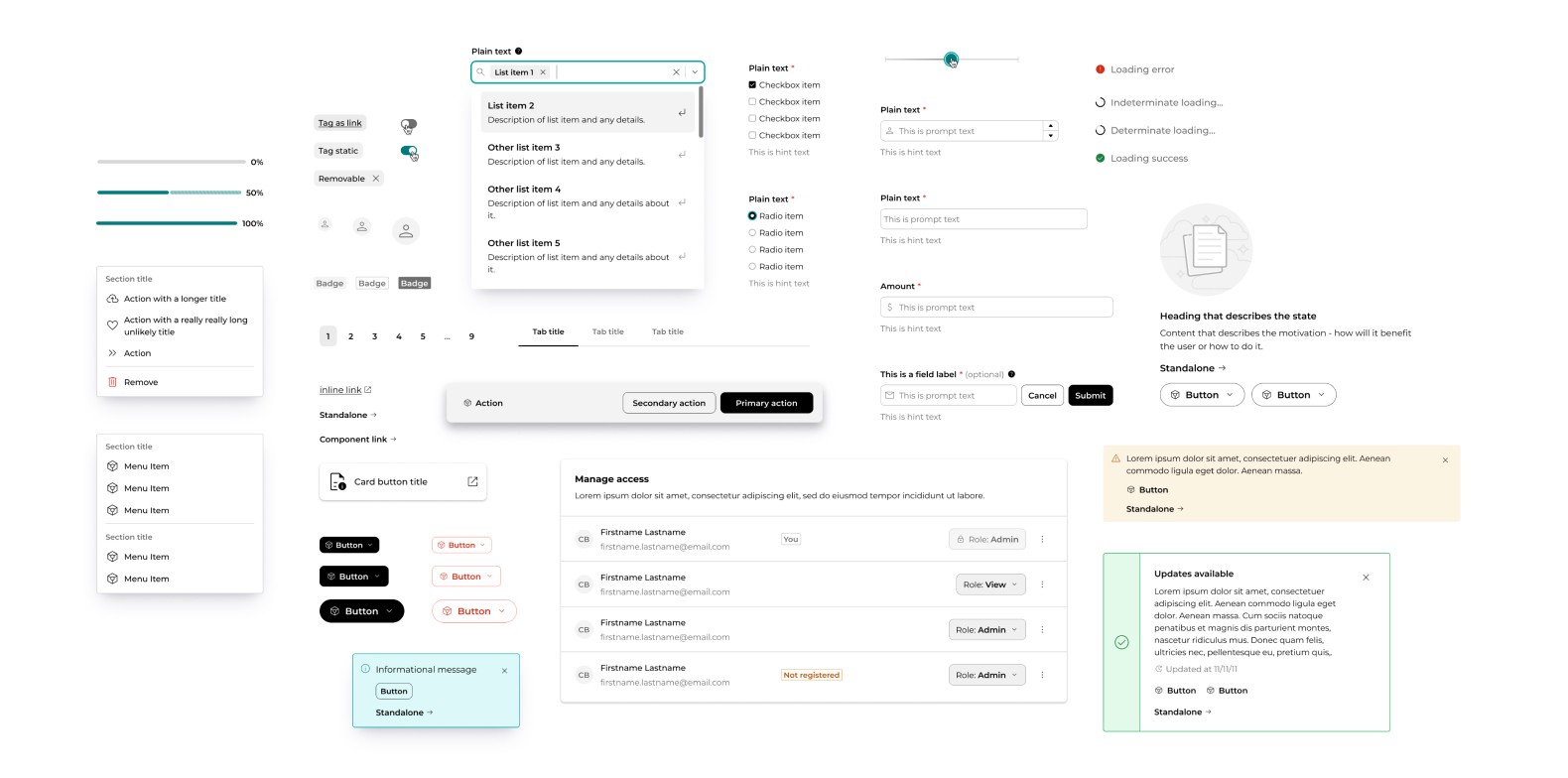
Some of the foundational components.
Documentation and specification
Created templates for component specification and storybook documentation.
These were captured as requirements in our new design definition of done / definition of ready (for dev) and component build was tracked in a separate dedicated 'Pallet' backlog.
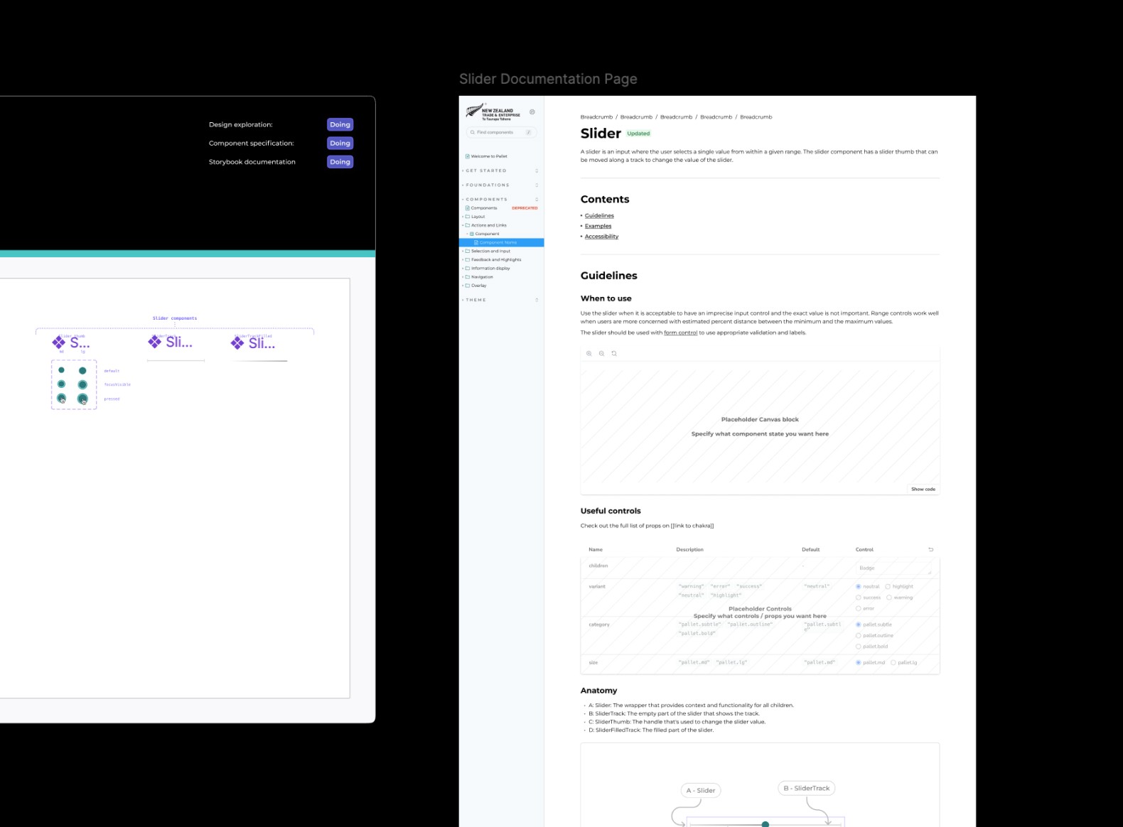
Handover specification template - all components required overview, controls, usage, links to storybook component, clear diagrams of states and variants, and documentation.

The component controls were aligned with ChakraUI props, and reflected (where possible) in figma's native controls.

Component documentation template - Component spec would be paired with a mockup of storybook documentation, this made it very clear to developers how to structure and build the documentation pages.
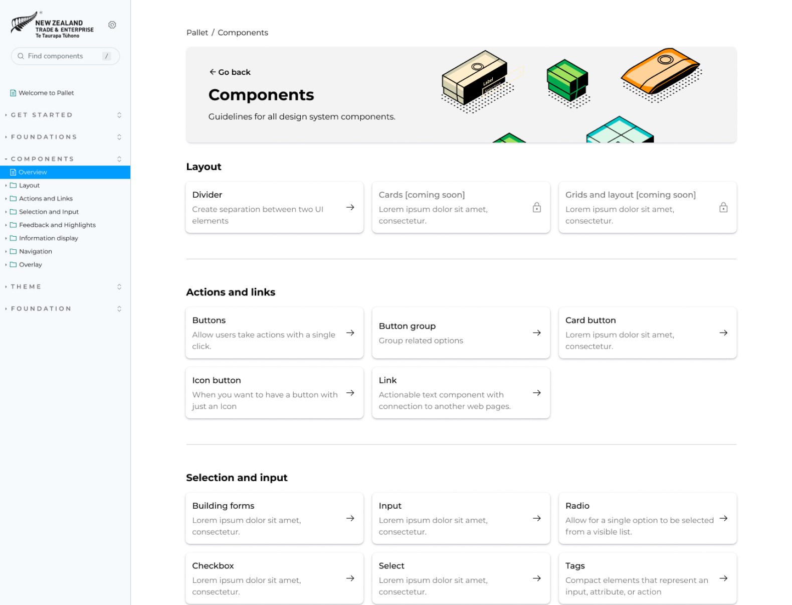
Storybook site for component documentation and guidelines - We used Storybook docs as our primary design system site. Inspired by the Monday.com design system, we used a combination of doc page, canvases, and our own components to build the interface.

First milestone
First feature built with 'Pallet'
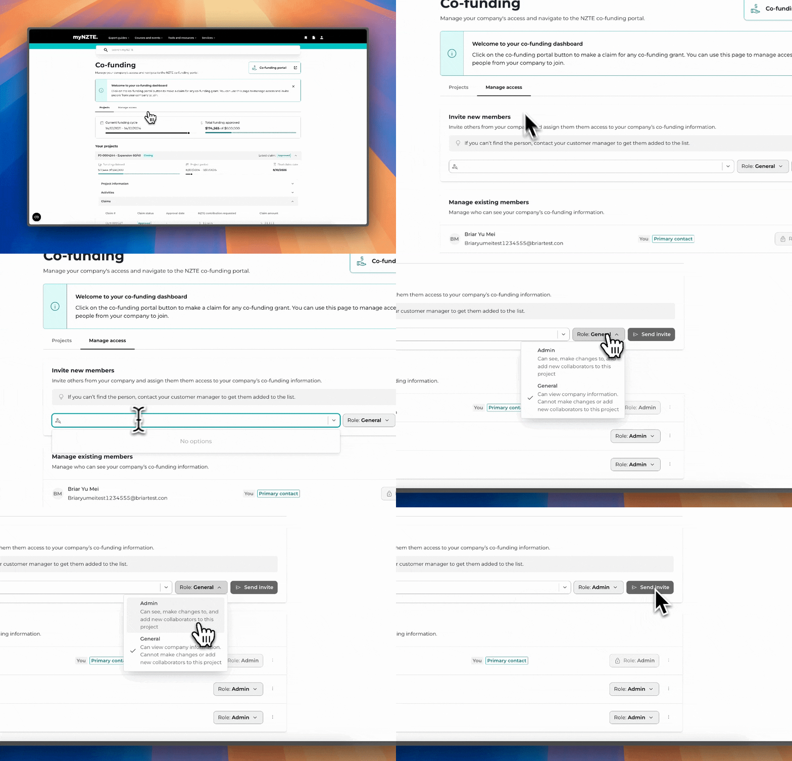
After a whole lotta groundwork and some solid foundations, we'd successfully built our first feature entirely with the new design system.
The handover process saw significant improvements:
✅ Pages are now marked up with linked components.

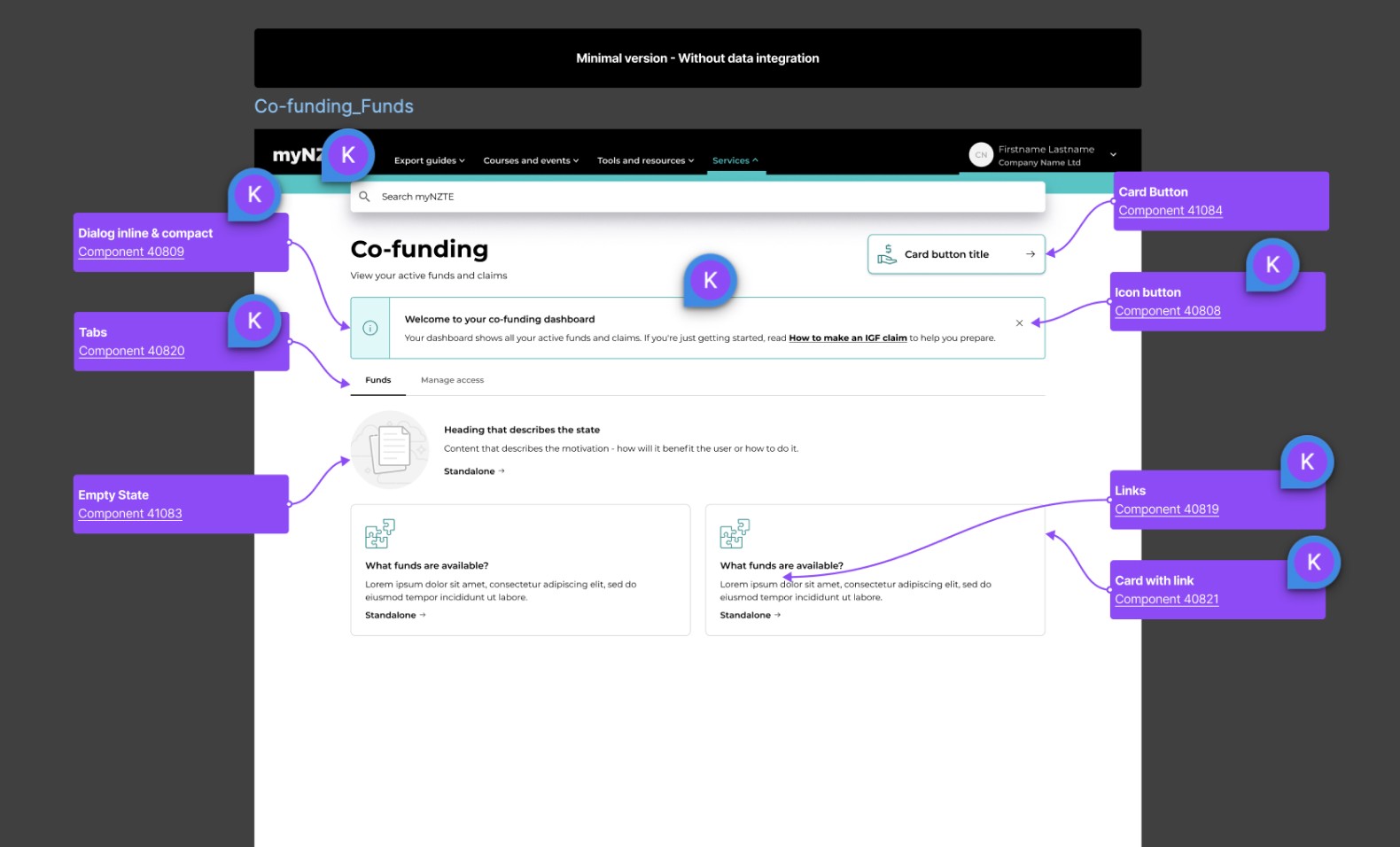
✅ Tokens are used consistently across all elements.
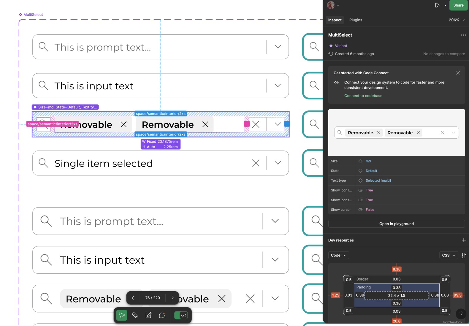
✅ New polished interface built entirely using Pallet components and standards.

Outcomes
What's next? …Governance
As of this writing, we are scaling the system beyond our squad - this has prioritised the need to better define our governance framework and establish some stability through improved documentation and standards. This effort has been kickstarted by a research initiative led by our other UX designer, Michelle.
The work in progress:
Contribution guidelines
Design and developer standards
Separate design system backlog
Component statuses
Guidelines for standardisation and refactoring
Changes in ownerships / roles and responsibilities with a scaled system
Communication channels
Additionally we're exploring opportunities to leverage the design system across other NZTE products and investigating how this impacts our approach to theming.
Personal feedback
Some feedback that was received for 'Right-Stuff' in-house recognition awards regarding design systems.
"Chris' work leading the design system work has been a huge undertaking, lots of learning, and opportunity to implement best practise. A massive thank you for adventuring into the unknown, going deep, and tackling every scenario that has come your way. We had a milestone moment in the design WIP call last week where every designer was using design systems in their work, and you can immediately see the value, efficiency, and major benefit this brings into how we work. Great work Chris, and a shout-out to Michelle and Jim (and of course Scott!), for the collaboration to make this successful and adopted in your way of working."
"Chris has done a next level job on all things design system. Every time I use the design system or grab a component, it's all there. Any detail/functionality I could expect or want is accounted for and then some. Not to mention, it looks disgustingly good. And to top it all off, he is super gracious when being hounded with questions about how us designers should be contributing, best practices, how we get things ready for the dev team etc. The man is a wizard."
"These 4 have displayed the NZTE characteristics of "Adventure teaches us" in their approach and work on the Design System. They have spent numerous hours working together on the Design Systems & Components to ensure NZTE has a valuable asset for years to come. They have worked collaboratively, have found a new appreciation for each others areas and are now all talking the same language. Way to go team!"
"I know that Chris was also nominated last month but he is absolutely on his A game at the moment so deserves it. His engagement, passion and leadership for the work in his space makes him a joy to work with. We will be in such a better place due to the work he has put in on Pallet (design system) in particular. Game changing!"
Reflections
Design systems are not a siloed effort
Building a truly useful design system is an enormous undertaking. The key to our success was leveraging each team member's unique talents and interests.
This project has fundamentally changed my approach to building digital products. It has been the most personally transformative piece of work I've undertaken, continuing to shape my perspective as we iterate on the system.
With the rise of libraries and frameworks like Shadcn, ChakraUI, and Radix - which make many design decisions upfront, designers must become adept at balancing custom solutions with pre-made components based on business requirements. This skill will be crucial in creating digital products efficiently.
Learn through doing
This was a big lesson in embracing experimentation, most of our best ideas came from just trying things out. It's easy to get caught up in a bubble of planning and concepts without making any progress - great research should continuously inform your decision-making, but how iterate you solution sometimes requires taking that exploration further by experimenting and pushing ideas even if they sometimes lead to non-viable solutions.
Thanks for reading, check out some of my other work below.
