NZTE ‣ Co-funding Portal: The evolution of building NZTE's customer-facing claims platform
Project overview
Business context
NZTE provides customers with different levels of funding support to help them accelerate their growth. These are given depending on the business's need, maturity, scale and capacity.
Businesses that NZTE work with more intensively are called Focus customers who can potentially get what is called an IGF (International Growth Fund) also named Co-funding.
The IGF provides 50:50 co-funding for businesses to accelerate their international growth - this funding could be used for international projects to address a specific need or capability gap, research or validate an international opportunity, or accelerate and expand in a strategic market.
The challenge
At the time, the amount of funds NZTE needed to support was about to increase from $30 million to $60 million - which in turn was likely to double the amount of claims processed from approximately 600 to at least 1200.
The average time to process a claim to customers was 21 days
The claim process requires 3 IGF Service Coordinators who spend 60% of their time on claim administration/management.
This kickstarted an initiative focused on evolving NZTE's processes to deal with increased demand by simplifying and accelerating the approval process and understanding how this could be supported with digital products in a way that minimised burden for NZTE in administering.
My role
My involvement on this project was at 3 three distinct stages of the product. Throughout these phases, I collaborated with and built upon the valuable contributions of other designers, analysts and engineers.
2020: Initial Discovery + Concepts - Initially brought onto this project to lead early design discovery and concept design, laying the foundation for the IGF claims self-service platform.
2021: Changes to requirements - Refined the user experience in response to new requirements and feedback.
2023: Design overhaul - Comprehensive design overhaul to support new claims management platform, bolstered by NZTE's new design system.
2020: Initial Discovery + Concepts
Kickoff workshop
The project started with a kickoff workshop to create alignment on what problem we were trying to solve and give some direction to the initial discovery work.
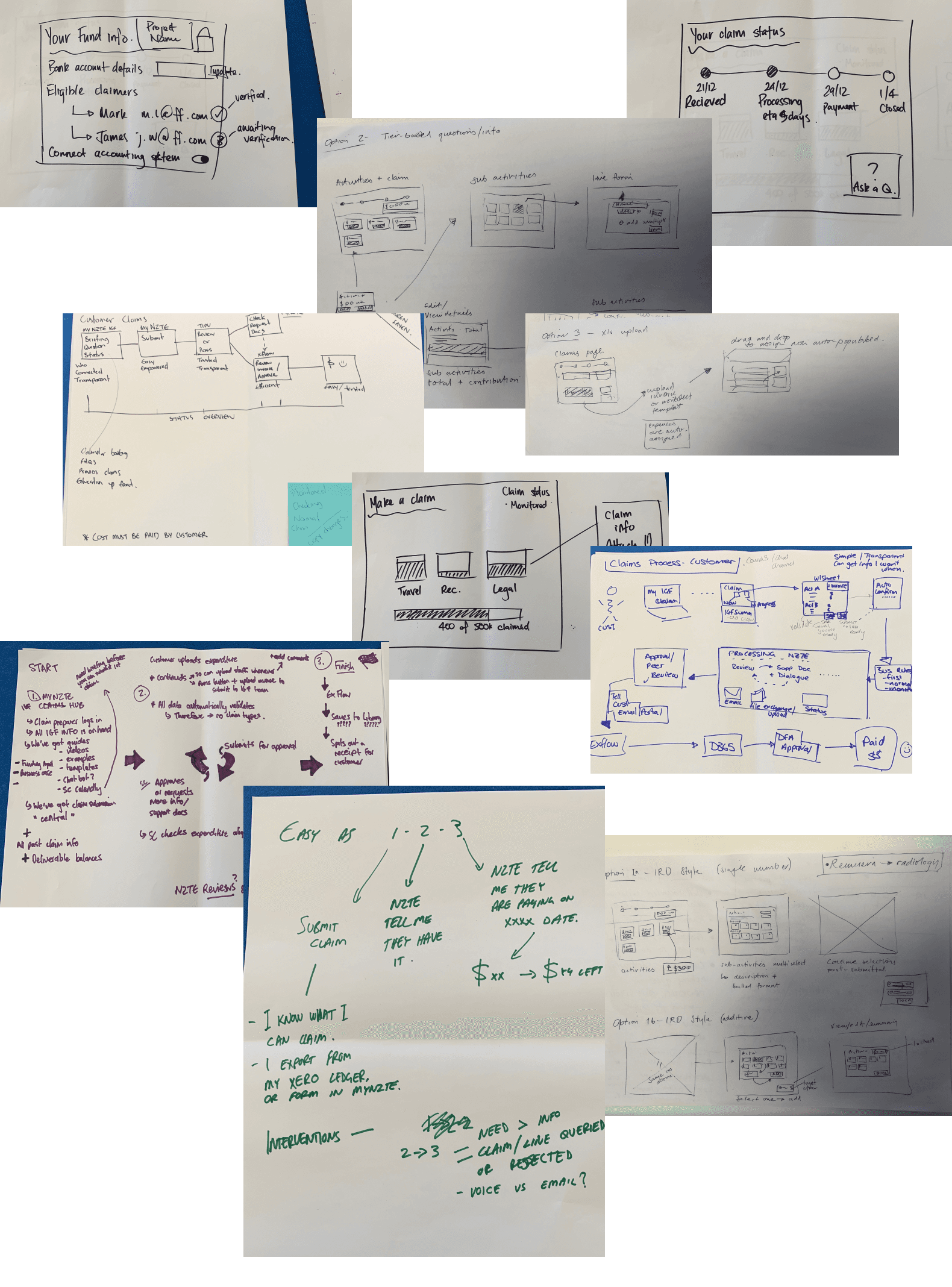
Highlights from the workshop solution jam.
The problem to solve
How can we simplify and accelerate the IGF claims experience for both the IGF team and customers to approve and pay more claims in less time?
The user focus
Someone who already has funding approved, who is ready to be introduced to the process of how to make a claim and then the process of making a claim.
Problem framing
How might we minimise human intervention in low value areas ensuring we deploy our people only when it is necessary
How might we re-profile our risk rules based on statistical analysis and machine learning
How might we leverage automations to speed in input of claim information
Assessing the current state
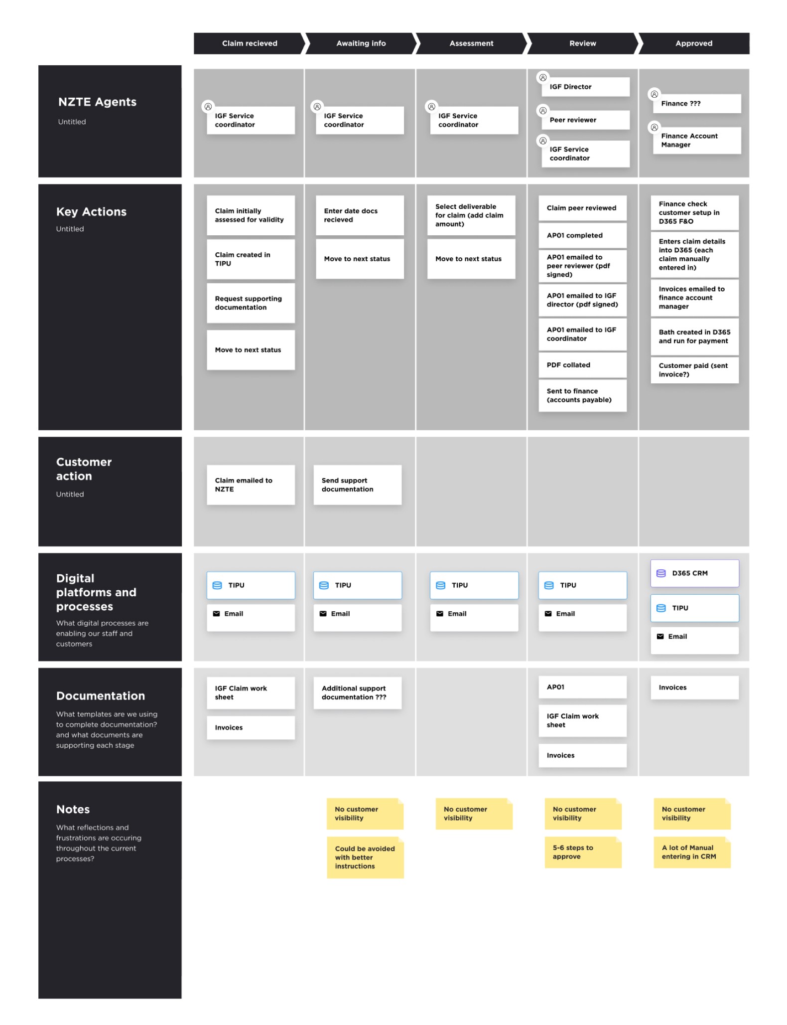
My goal was to understand NZTE's current claims process and identify solvable problems. We conducted exploratory research and stakeholder interviews to gather insights on the current state, which I could then use to inform my design decisions.
Well-done discoveries ensure that any solutions proposed later are desirable to users, viable for the organisation, and feasible with the technology made available.
Stakeholder interviews
We started off talking to NZTE customer managers and advisors as they took us through their day-to-day process for processing claims. This was a combination of diary studies and a unstructured interviews.
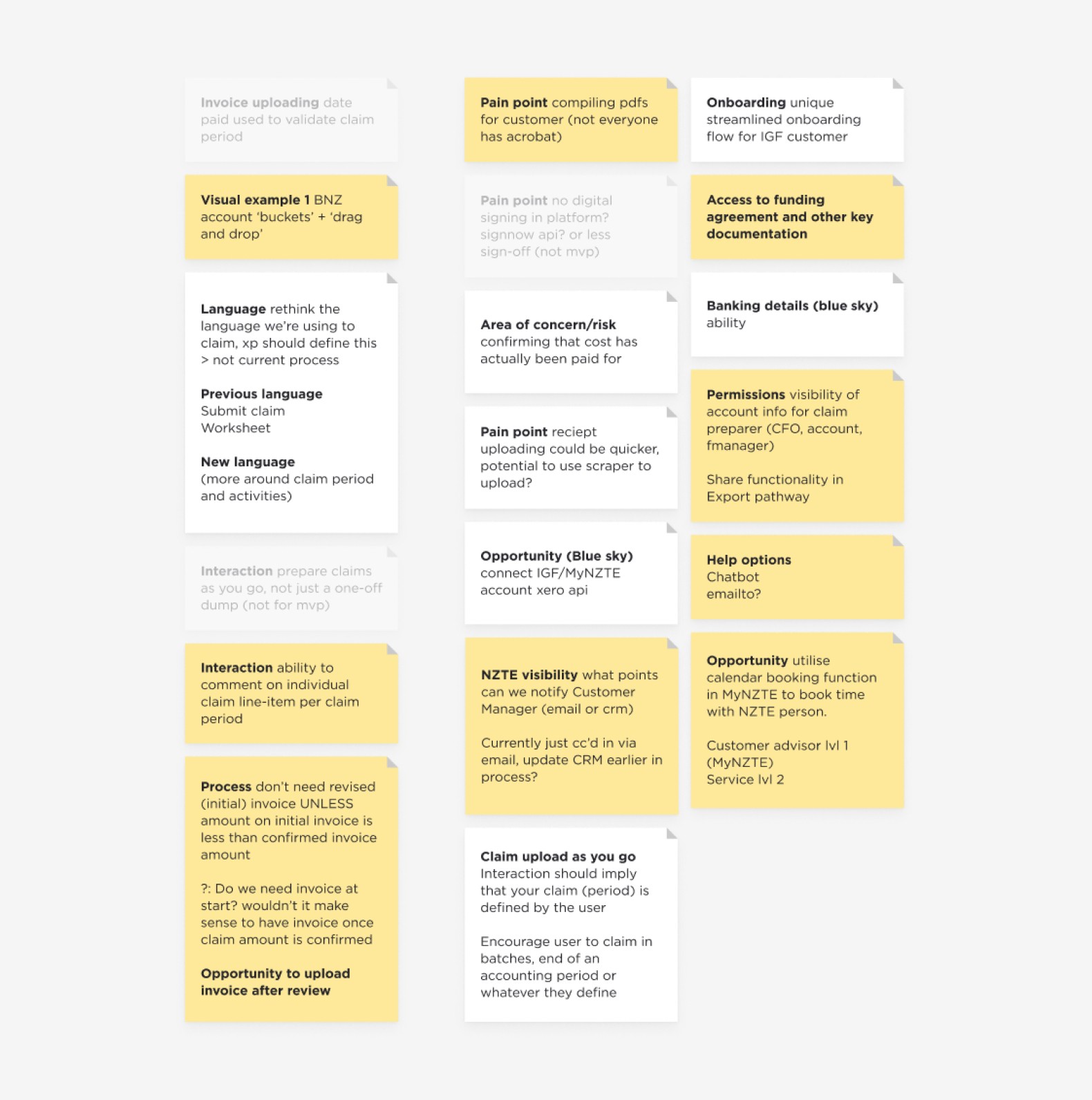
General feedback summary
Journey map to understand current state
Concept exploration
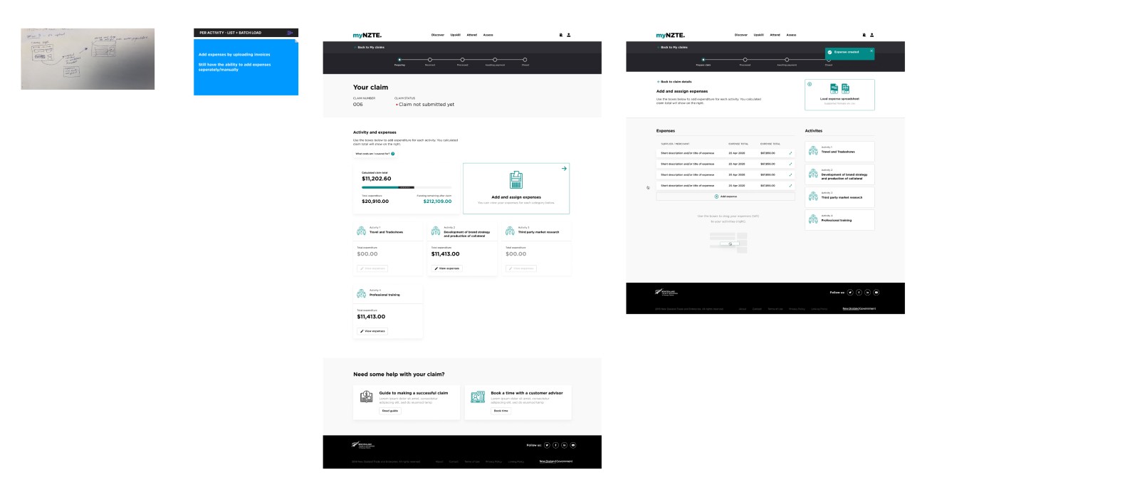
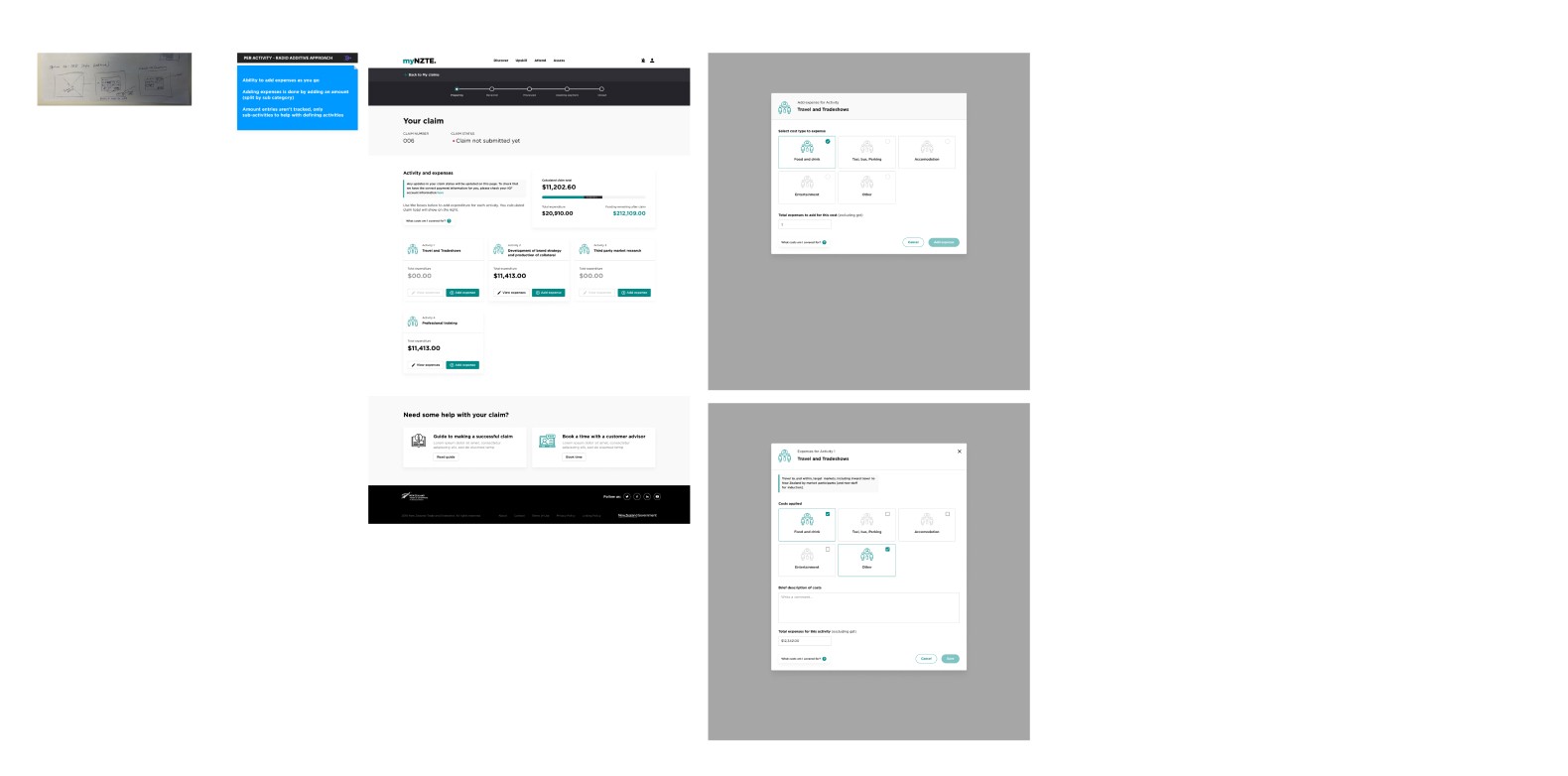
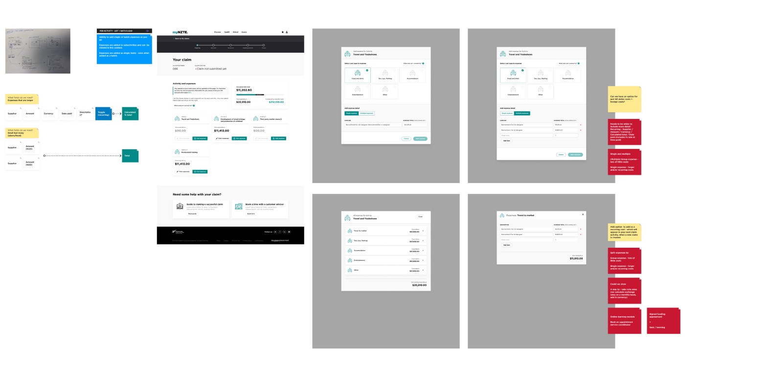
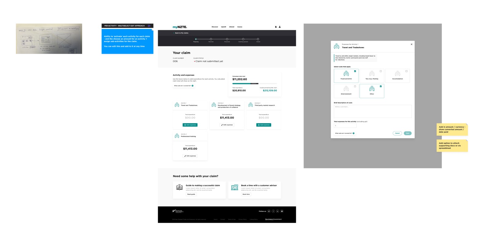
With key insights from stakeholders, the next objective was to create some concepts to communicate the value with business stakeholders and help gain buy-in. We were selling the dream a bit - so we leaned a little more into 'high-fidelity' versions.
Initial concept exploration
Customer interviews
We then took these concepts and used them as talking points to gather insights from 4 customers. These customers all had active funds and had prior experience submitting claims.
Screenshot from the prototype

Highlights from customer feedback
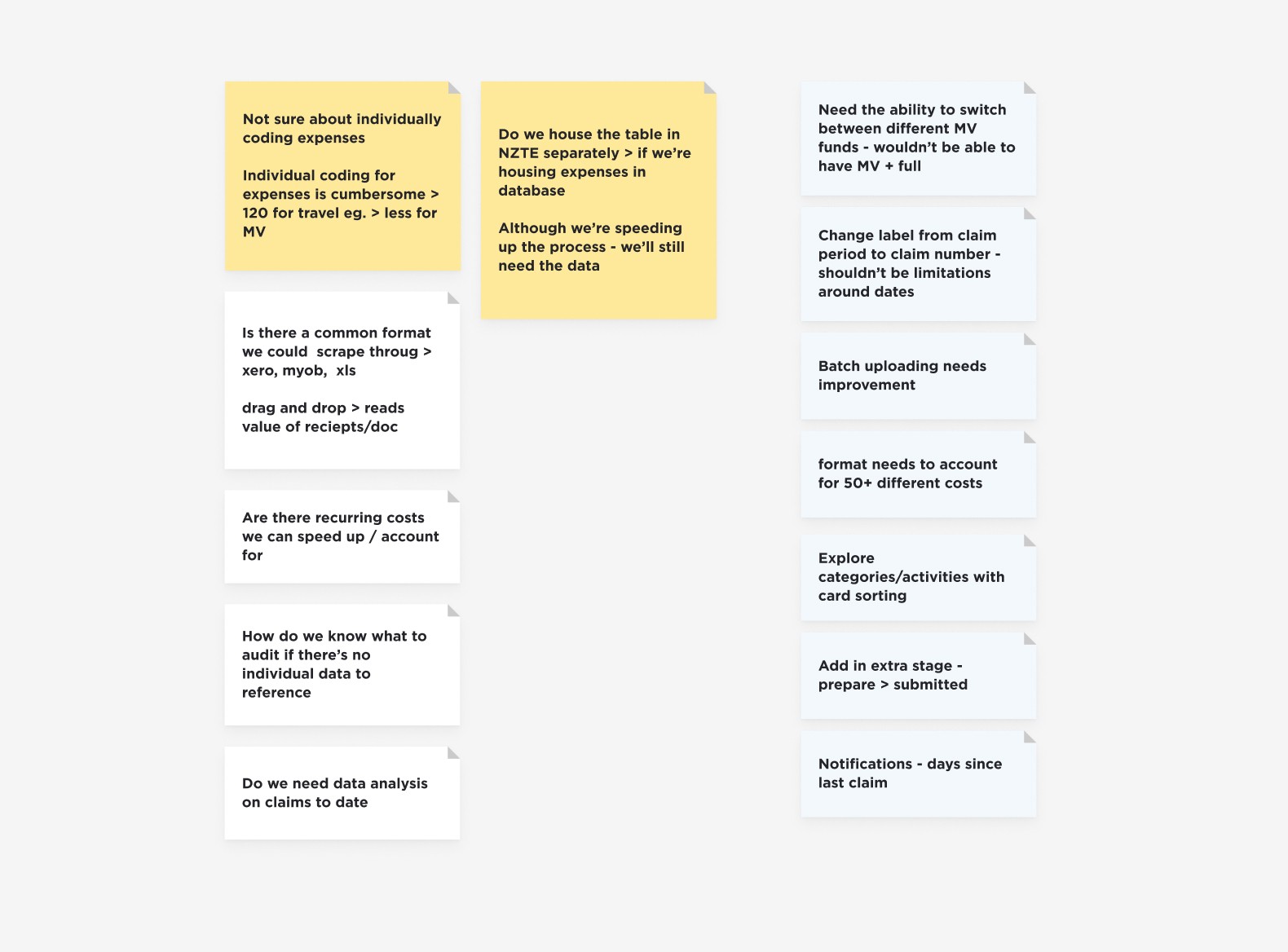
Design exploration
At this point, we had a solid understanding of the problems to be solved and the opportunities available. I had a clear design goal for exploration. We could then present these back to stakeholders and move forward with the next phase of design.
The design goal
Create a customer-facing interface on myNZTE to enable customers to submit, manage, and receive updates on their IGF claims.
The experience should be intuitive and provide customers with enough context and guidance to submit 'successful' claims.
This will ensure customers have more visibility of their IGF funding and claims, more control over their claims, and less back-and-forth communication.
Outcomes for a customer
I know where/what info is: Informed
I know who: connected and supported
It’s easy + simple + efficient
Empowered
Trusted
Transparent
Not bureaucratic
Outcomes for customer advisors and mangers
Relieved / less work
Valuable work
Low risk / confident / safe
Efficient
Flexible
Involved
Integrated / not siloed
Initial requirements
Customer visibility of their total fund (excludes coalitions)
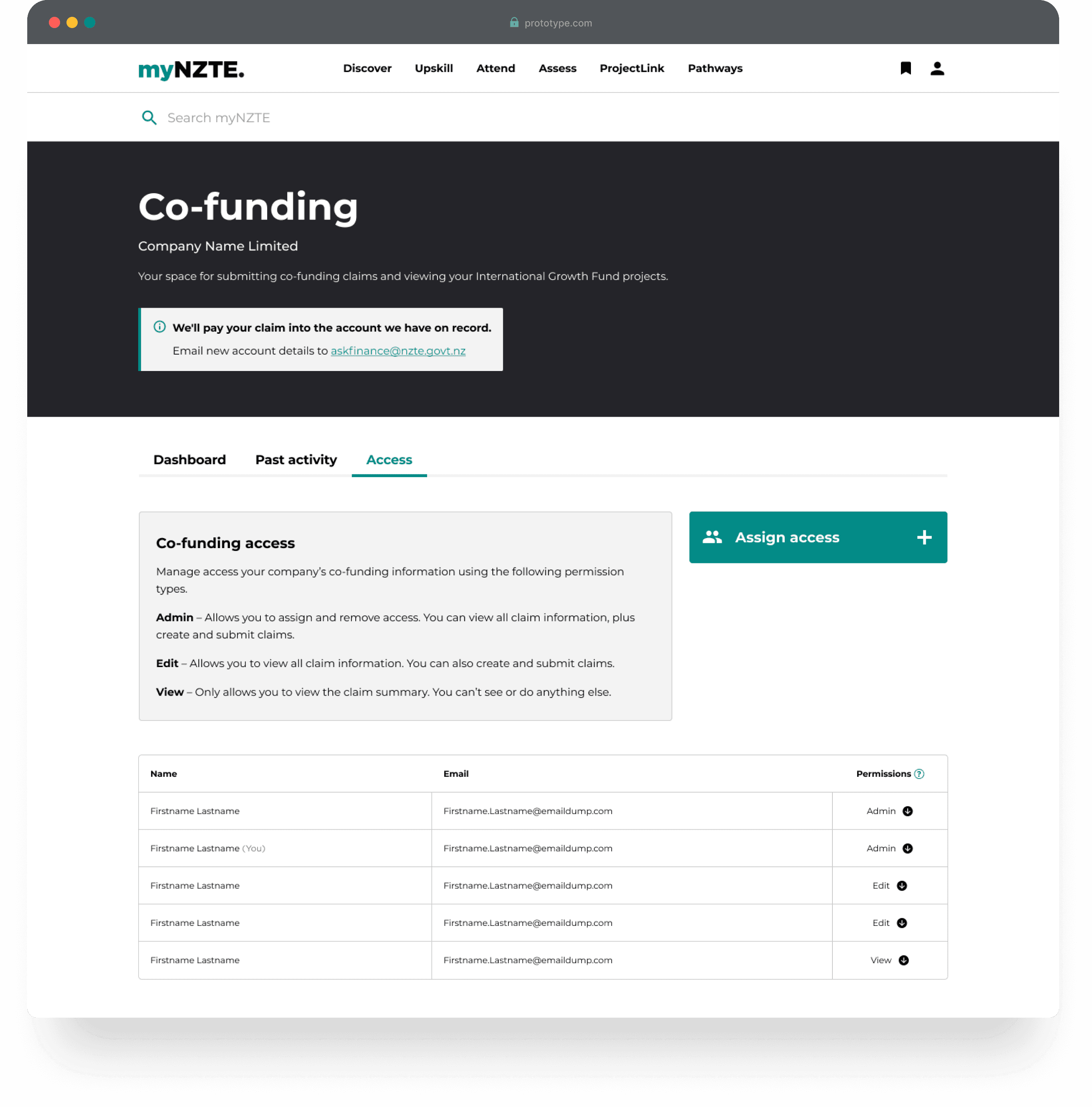
Roles/permissions for access and action
Customer input for a new claim
Claim status and history
Level 1 support
Outputs
Mapping the IA

User flow for ideal state

Screen flow

Workshop
Equipped with a prototype, a user flow and a whole lotta questions, I conducted a two day workshop with customer advisors, product manager, product owner and design.
We needed to know what parts of our internal process need to adapt to enable us to deliver our proposed digital experience.
Workshop objectives:
Create a shared understanding of what is our product is and what problem are we trying to solve.
Elaborate on problems and reframe into standardised ‘How might we challenges’
Map out our intended customer and internal experience
Use map to target key areas of focus (where are the most challenges)
Ideate how we might solve challenges
Day 1 agenda
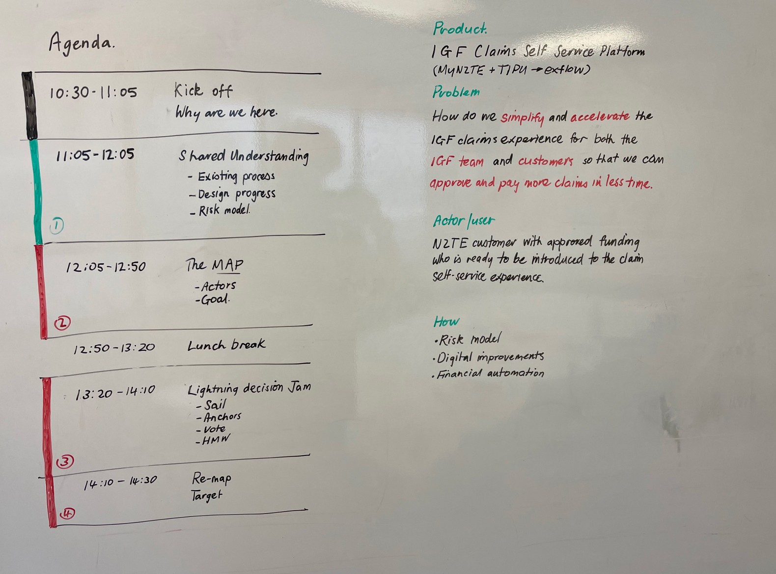
Doodles from lightning decision jam

Mapping out the current process
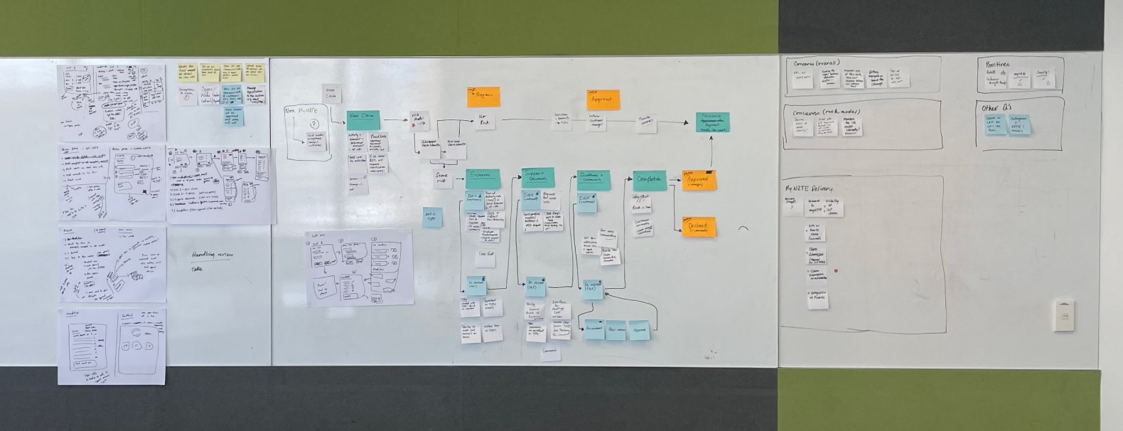
Mapping out revised process

Final concepts
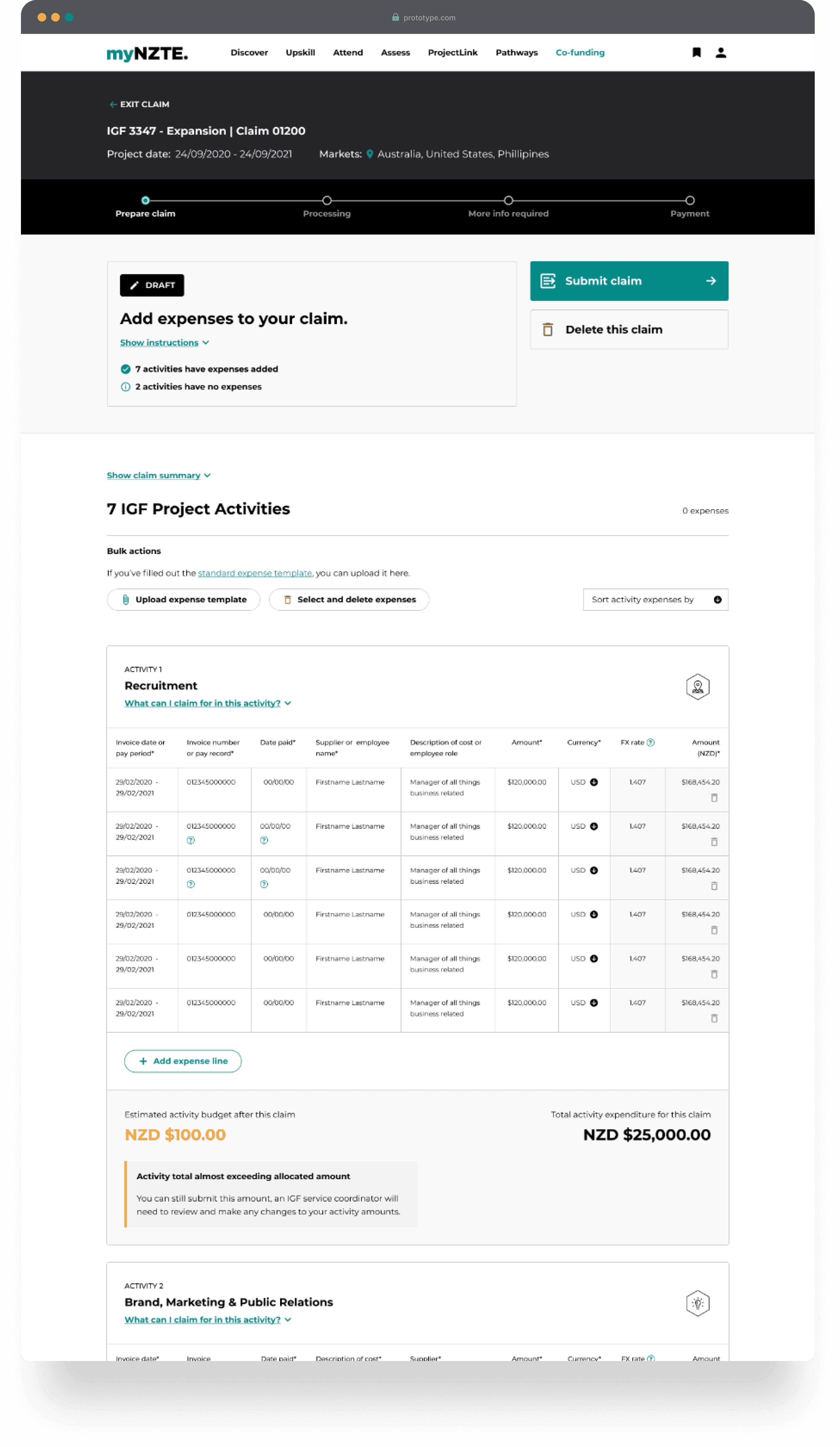
Based on insights and ideas from the workshop, I created a final round of designs that covered the entire user experience for both future-state and MVP scenarios.
After completing this work, I prepared it for handover to another designer as my focus was shifting to a new project.
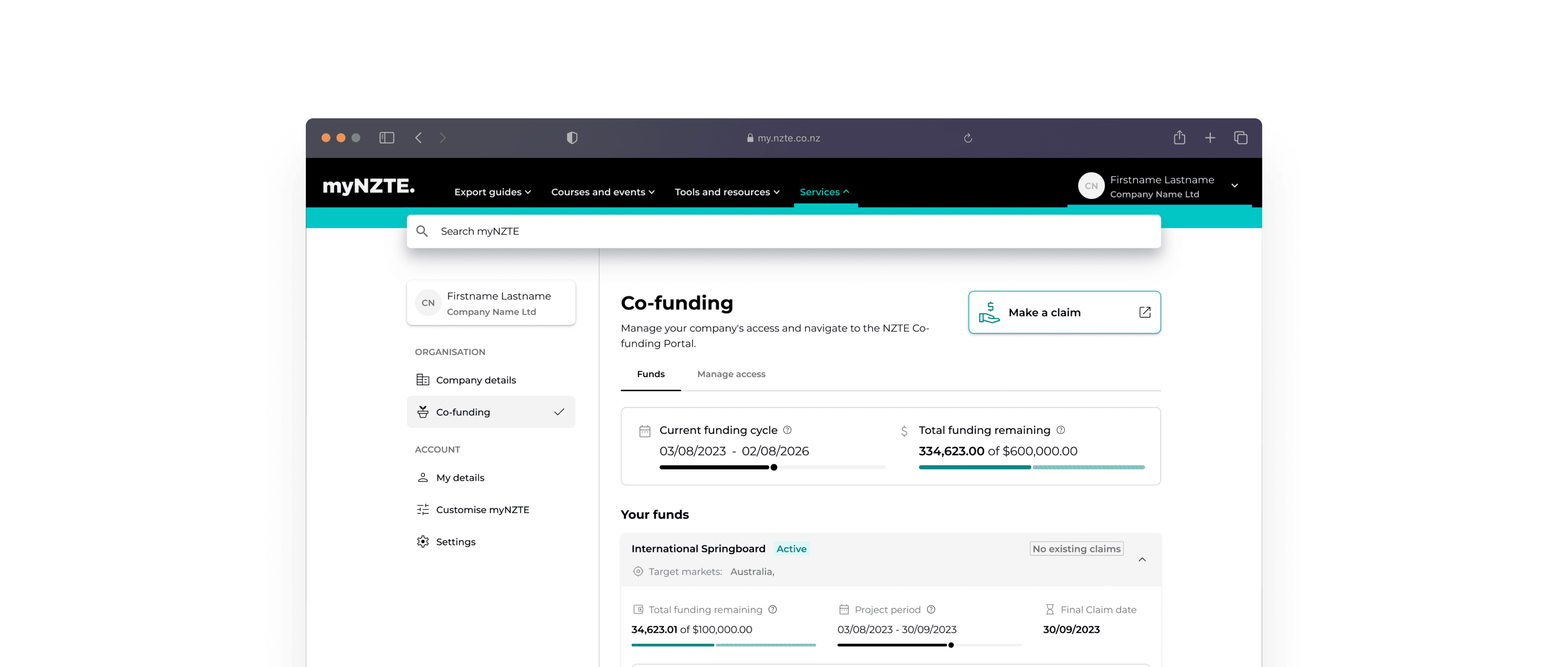
Co-funding dashboard
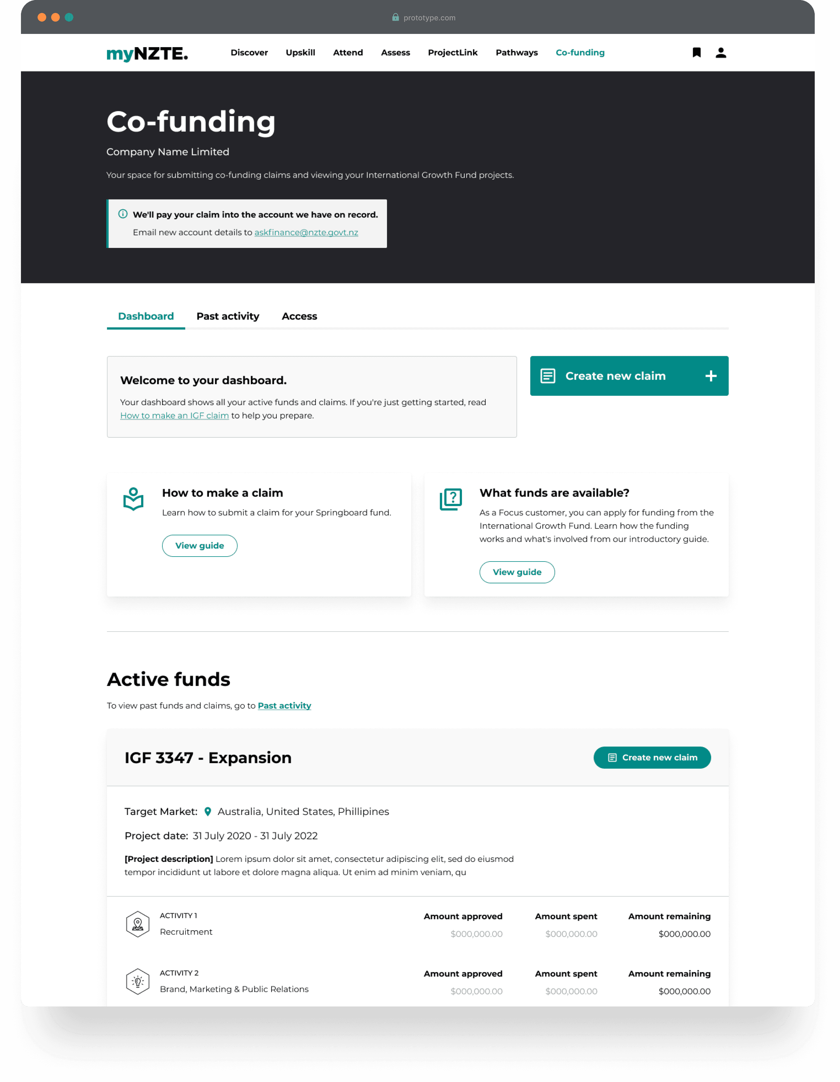
Claim - Adding expenses and supporting documentation
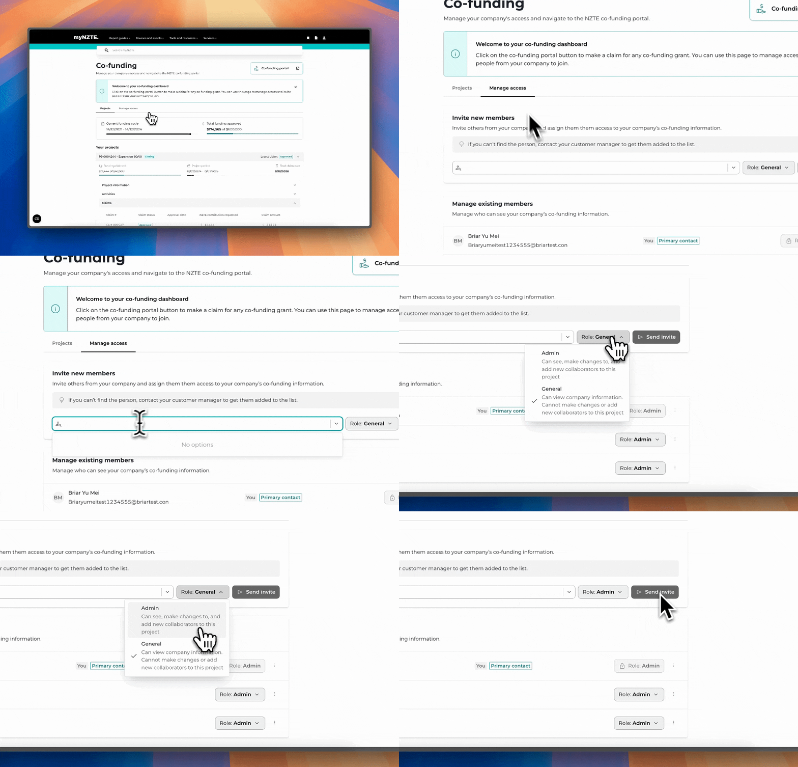
Manage co-funding user permissions
2021: Feedback + Improvements
A change in requirements
A few months later we were still in the design and build phase of the project. The Claims Model integration with TIPU (NZTE's funding management system) had just gone live, and a proposal had been made to introduce the Springboard process (our smaller claims) under the IGF settings.
Extensive analysis and design exploration had taken place up to this point, resulting in some fundamental changes to the requirements. Additionally, we'd received some key usability feedback from customer testing on the existing designs that needed addressing.
So, I was brought onto the project to tweak some things.
Design goals
Adjust the interface to align with the new requirements
Further simplify the claims self-service experience on myNZTE
Address customer usability feedback
Design changes
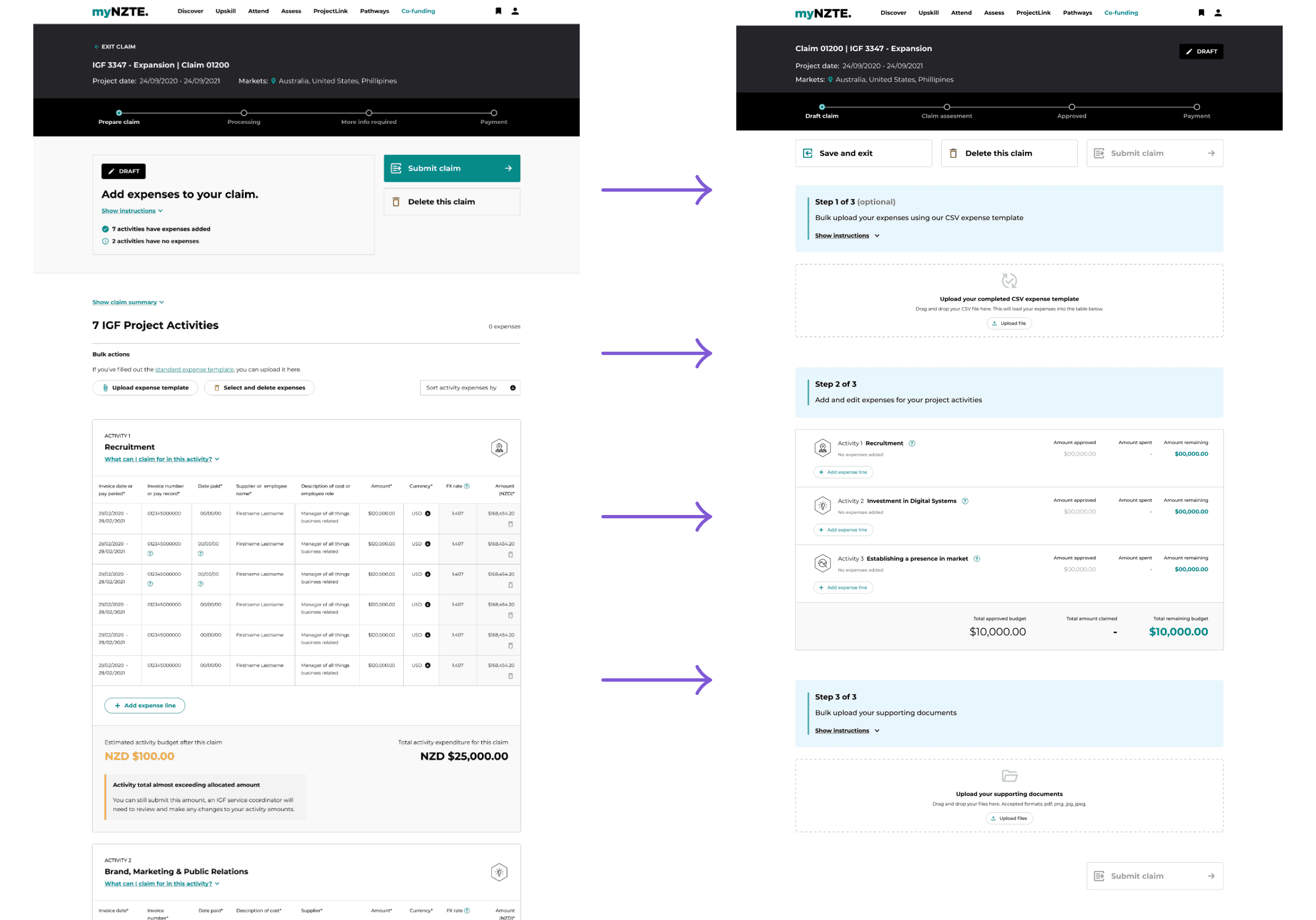
Key usability and layout changes included:
Rearranged and reduced clutter at top of page
Clearly labelled steps with collapsable help guides
Larger file upload components
Call to actions given shared hierarchy
Customer testing
With the new designs, myself and 2 others conducted user testing with 6 existing customers. These customers all had active funds and had prior experience submitting claims.
Reviewed existing overview pages
Tested new claim and expense adding interface
Expectations around file upload and supporting docs
Invoice upload
Post-testing changes
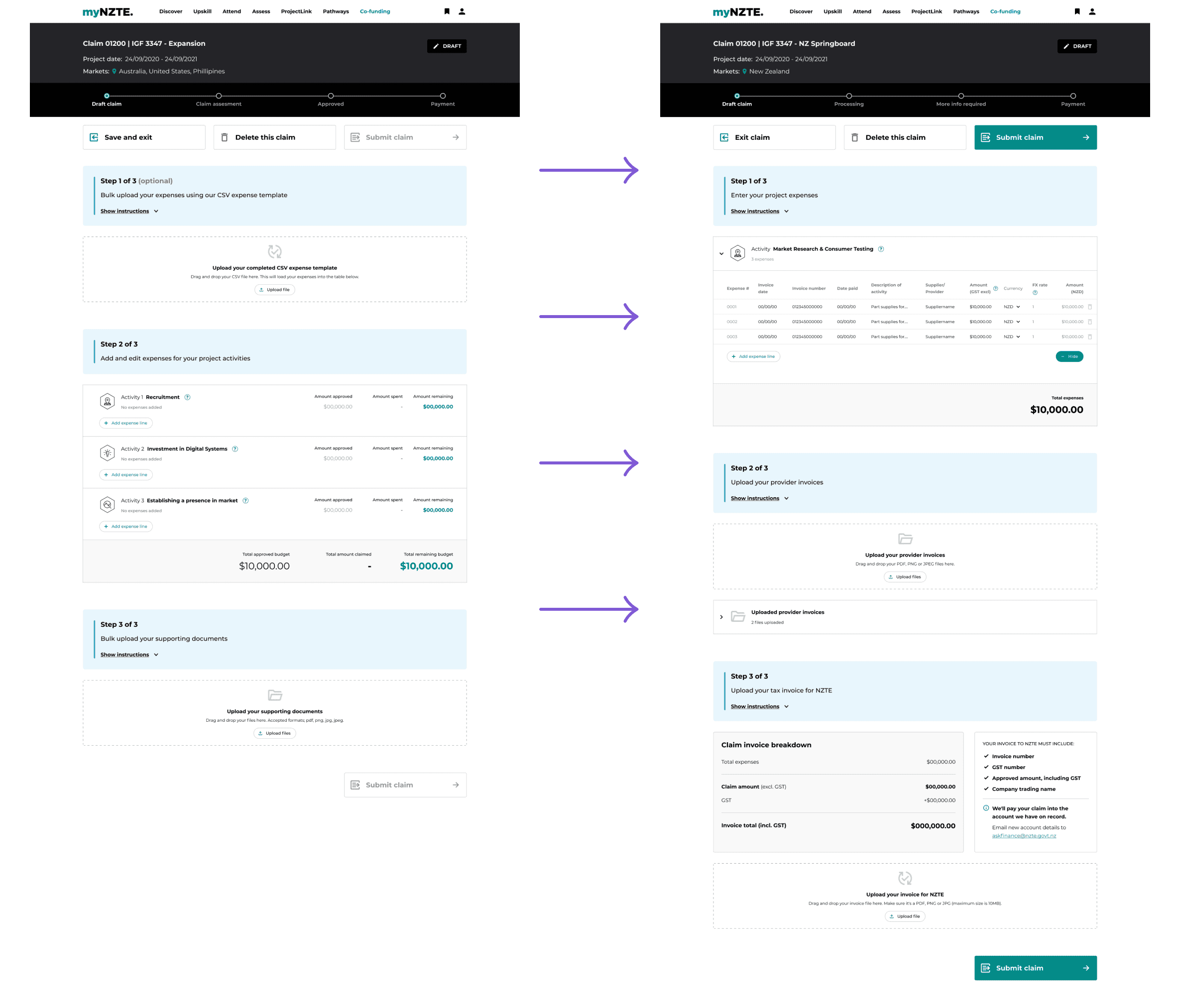
Bonus feature - Invoice scanner
This ended up being one of our most impactful features, where since implementing it there have been ZERO errors in customer invoices.
Customers could upload their invoice which we would scan for errors and compliance, would take from 10-20 seconds.

2023: Design overhaul
A New Front-Door for Claims
Almost 2 years later, the claims process was migrated to a new third-party claims management application. However, the app's UI was cluttered and confusing for users.
To address this issue and maintain clarity and visibility of claims, we were tasked with creating a 'front-door' on myNZTE where we could surface CRM and claims data in a way that made sense to users.
This was well timed with the build of our new design system, so we used it as proving ground to build the entire feature using design system components.
Using 23+ new design system components

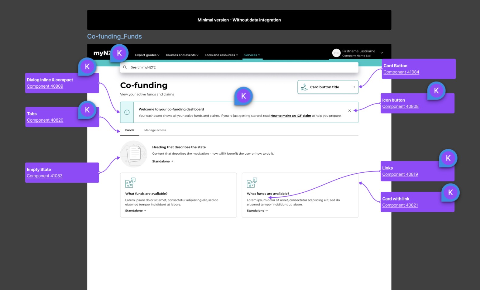
The shift to the new polished UI

The latest iteration in dev (with dummy data)

Thanks for reading, check out some of my other work below.

